"Many other camp experience sites failed to offer an accessible and user-centric approach to their site. In our research we noticed a pattern of this and wanted to present an immersive experience for all. "Daxko

Q: Tell us about your initial moodboard, wireframe, or prototype. How did things change throughout the process?
A: Before getting to mood boards and wireframes we did a deep dive into other camp websites to gain understanding of the landscape. We also interviewed parents who attended camp, who now have children attending. Based on that research we then created mood/brand boards based on the Y brand and the physical camp. Taking these steps kept our design process streamlined because the client knew what to expect and we sweetened the experience from there.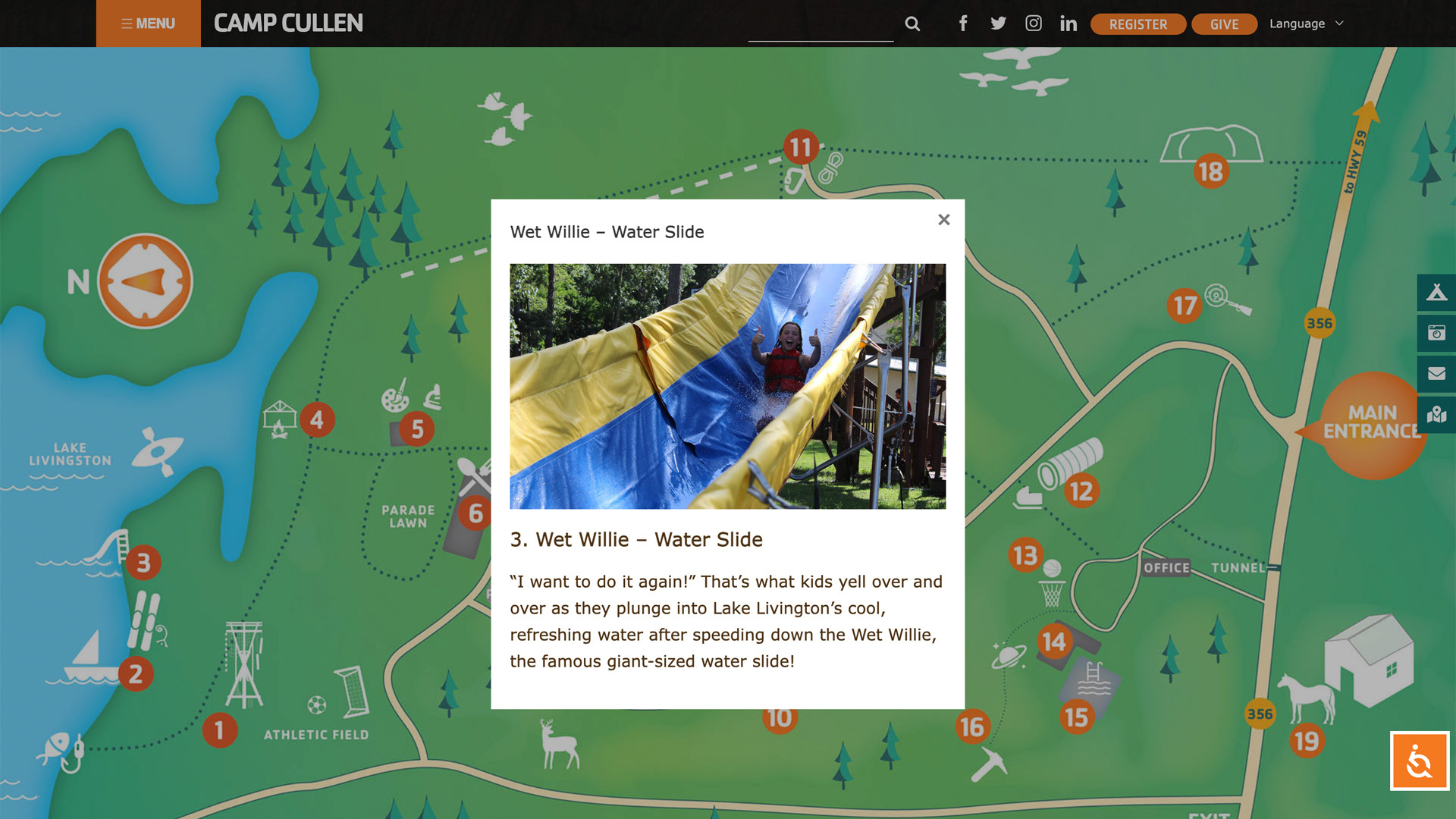
Q: What influenced your chosen technical approach, and how did it go beyond past methods?
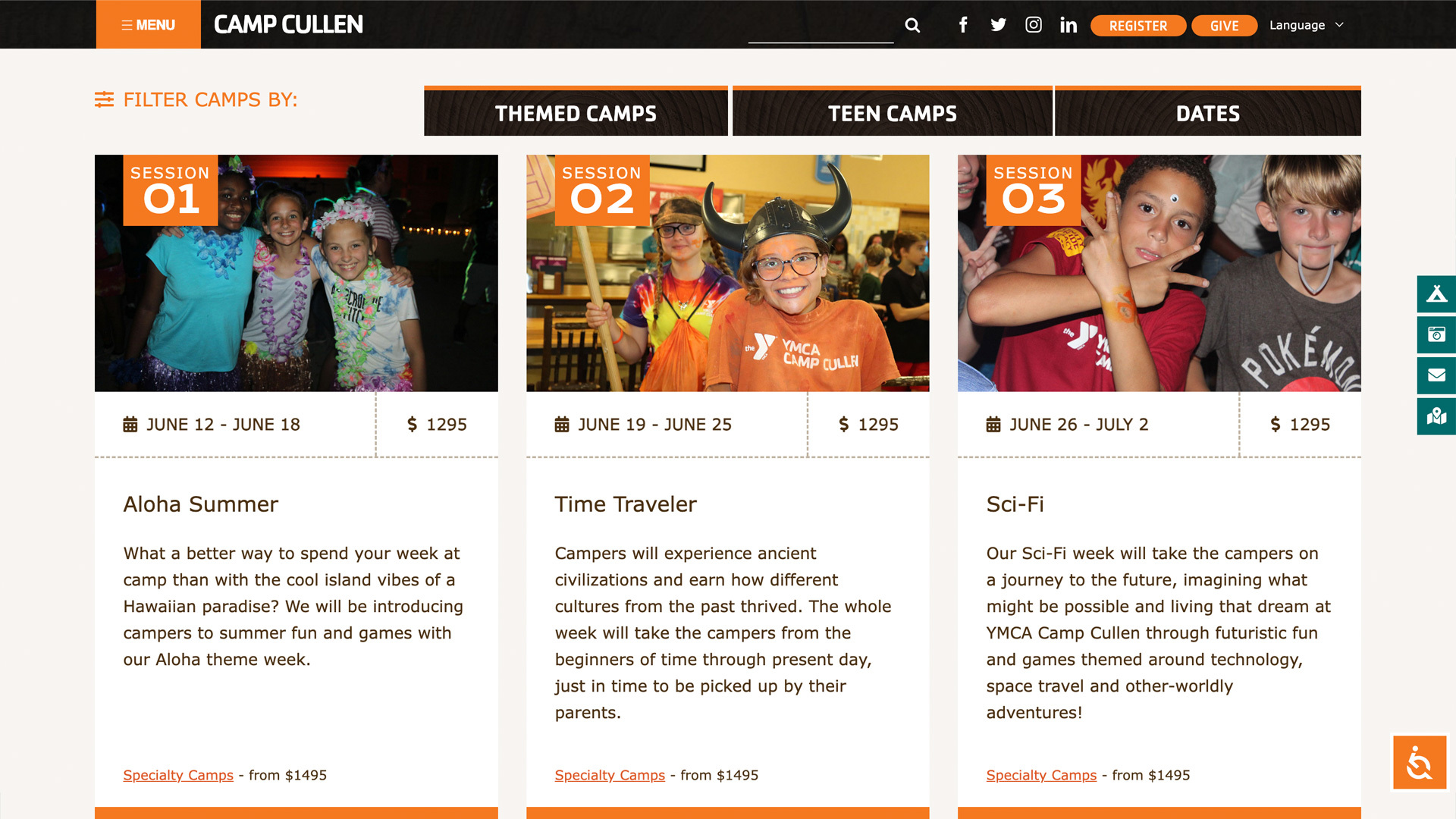
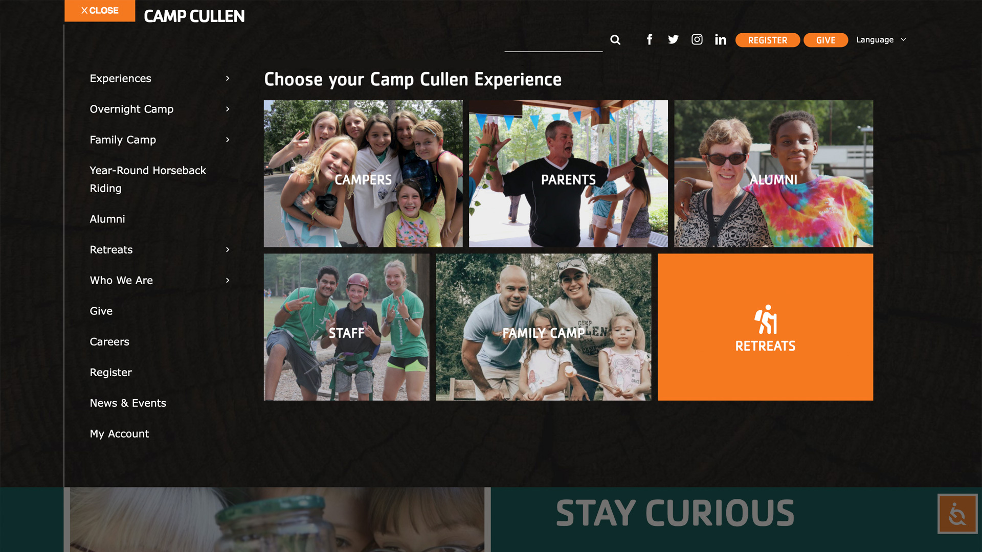
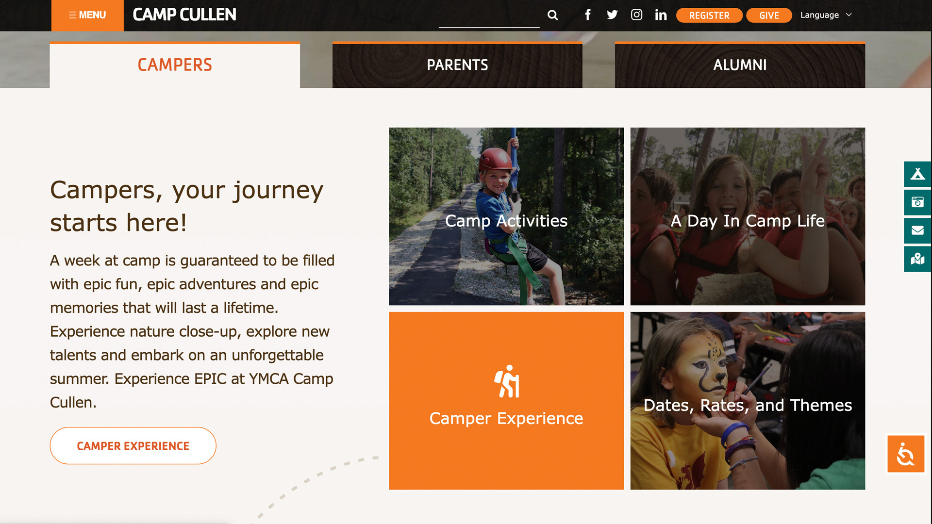
A: The client currently had experience with the WordPress platform, so it made sense to stay with WP. We created a custom navigation system that includes "experiences" for better user flow, side navigation that focused on quick action items, integrated video, accessibility tools, language tools and an interactive map. We took the time to work with the client to meet the needs of the mission and this included the technical approaches.When did you experience a breakthrough or an "a-ha" moment during this project?
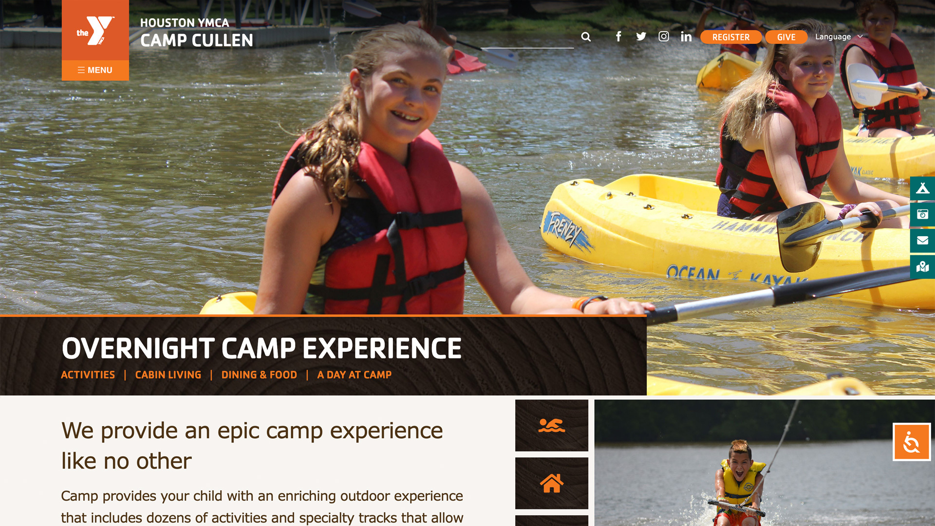
Many other camp experience sites failed to offer an accessible and user-centric approach to their site. In our research we noticed a pattern of this and wanted to present an immersive experience for all. We took a deep dive into what parents and children alike would be looking for in a camp experience at Camp Cullen and translated that into one that gave the user a sense of experiencing the camp before even stepping foot on the property.
Q: What web technologies, tools, and resources did you use to develop this?
A: The site was built on WordPress and is fully custom. We started with research, then provided mood boards to nail the concept. Next we created the sitemap using Flowmapp. Adobe XD was used to develop prototypes and design systems so we could easily demonstrate concepts with the client and ease hand-off to the development team. We used a custom WP theme designed for the client, to ensure the experience came to life on all platforms.