"We spent a lot of dev hours on little things; nowadays we’re used to scrolling through sites super fast, but we wanted to reward slowing down and exploring."Whiteboard

Q: Tell us about your initial moodboard, wireframe, or prototype. How did things change throughout the process?
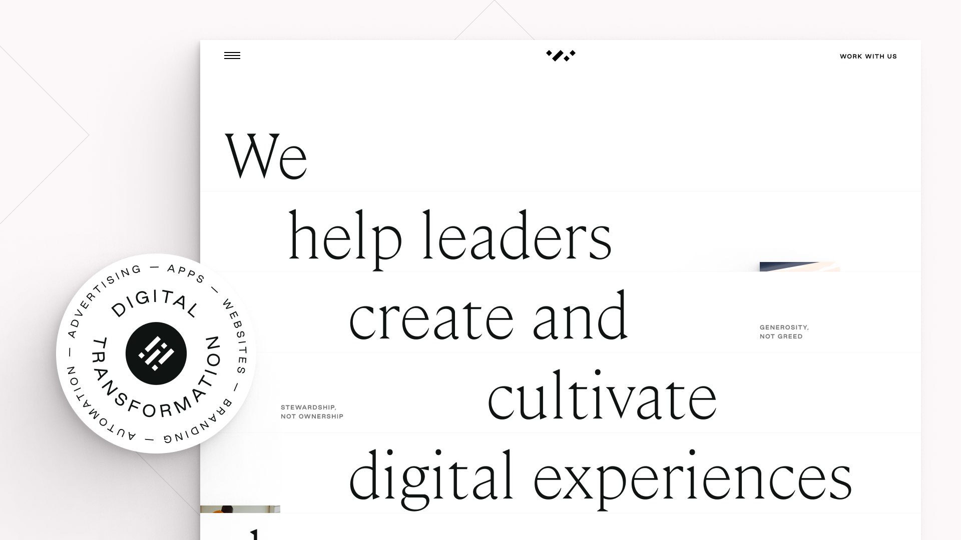
A: Our brand is very type-driven — Cambon is a gorgeous serif and Good Sans is quirky. They pair beautifully and there’s always some interesting tension when they’re combined. So, when we were establishing our creative direction, we really wanted to push into more editorial concepts, highlight beautiful media and reference some of the compositional cues of the work of David Hockney and the broader world of photographic collage.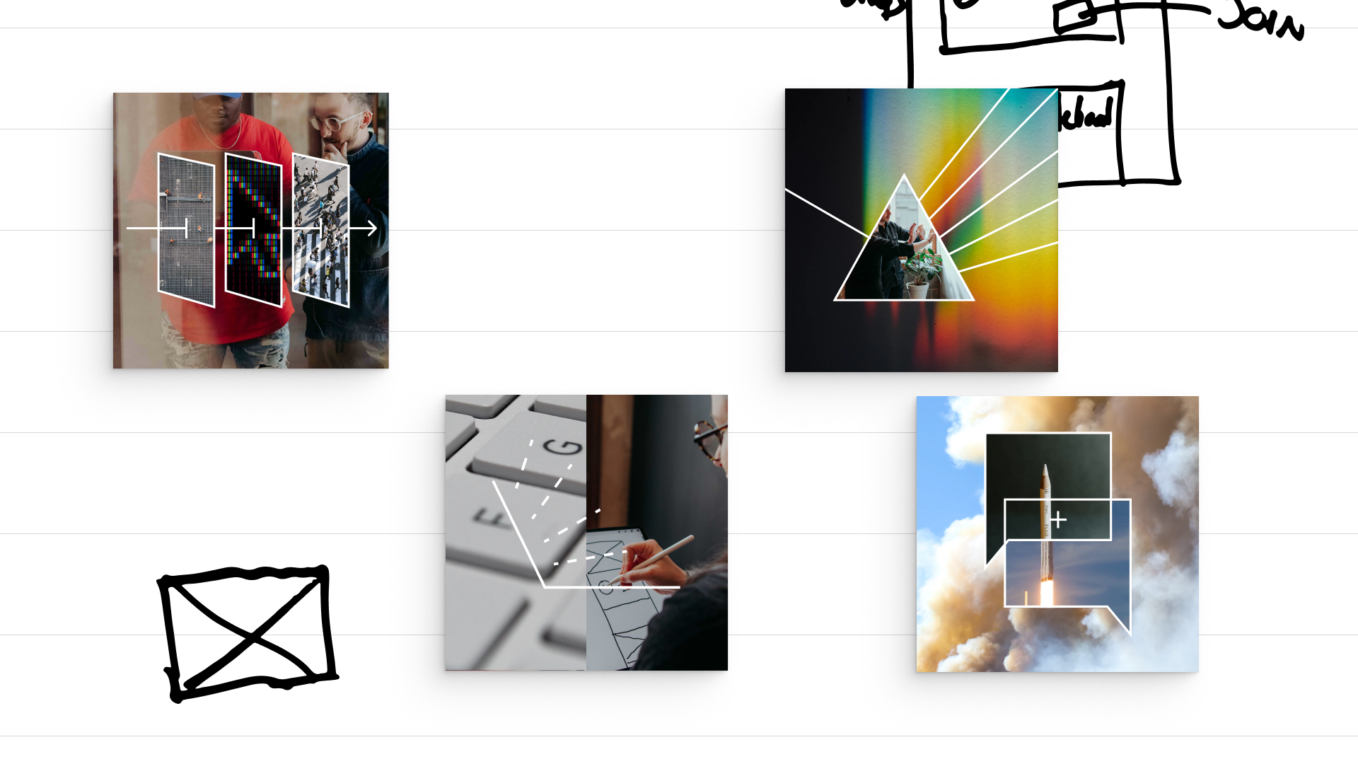
Q: What influenced your chosen technical approach, and how did it go beyond past methods?
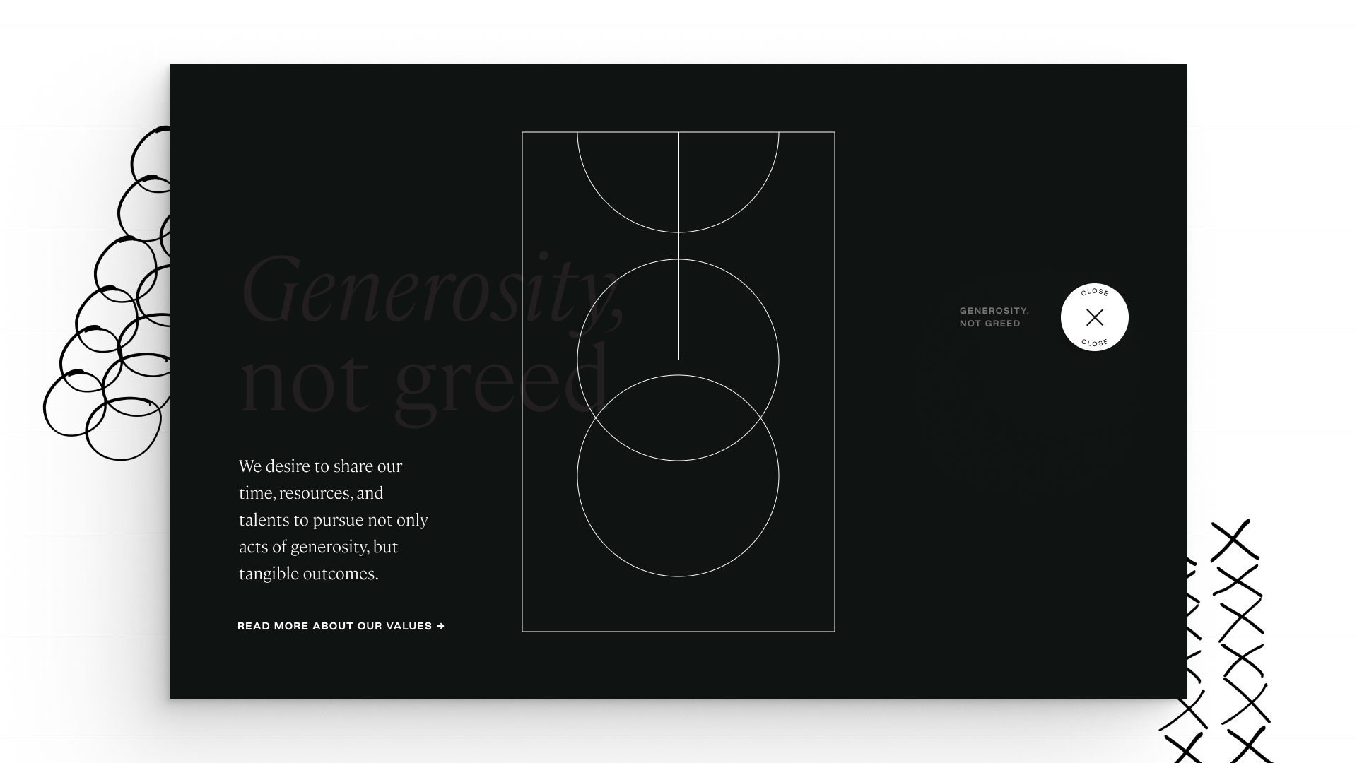
A: We spent a lot of dev hours on little things; nowadays we’re used to scrolling through sites super fast, but we wanted to reward slowing down and exploring. That required more attention to detail, a break from a more typical design system-forward approach — and a more section-specific effort towards interaction design, especially in the easter eggs in the first few sections. It’s okay if you miss them, but it’s magic if you don’t.When did you experience a breakthrough or an "a-ha" moment during this project?
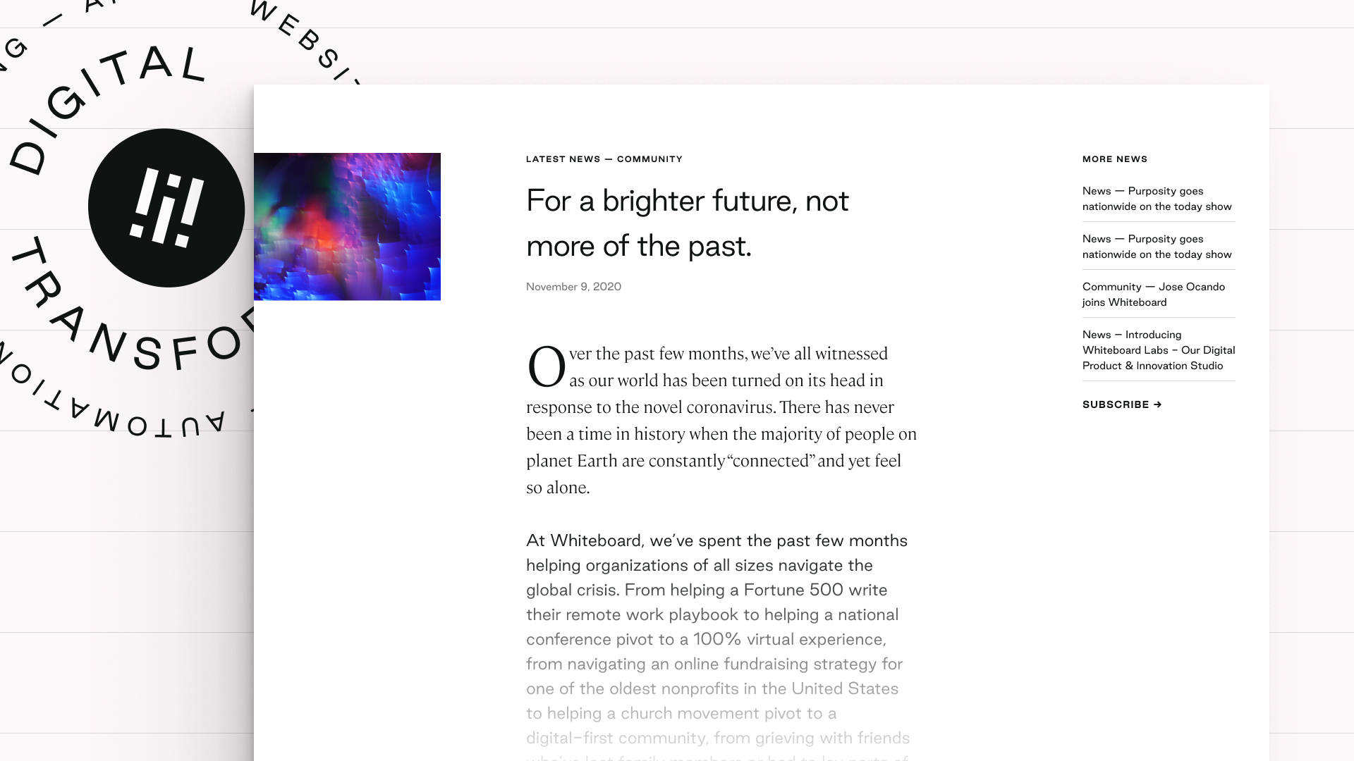
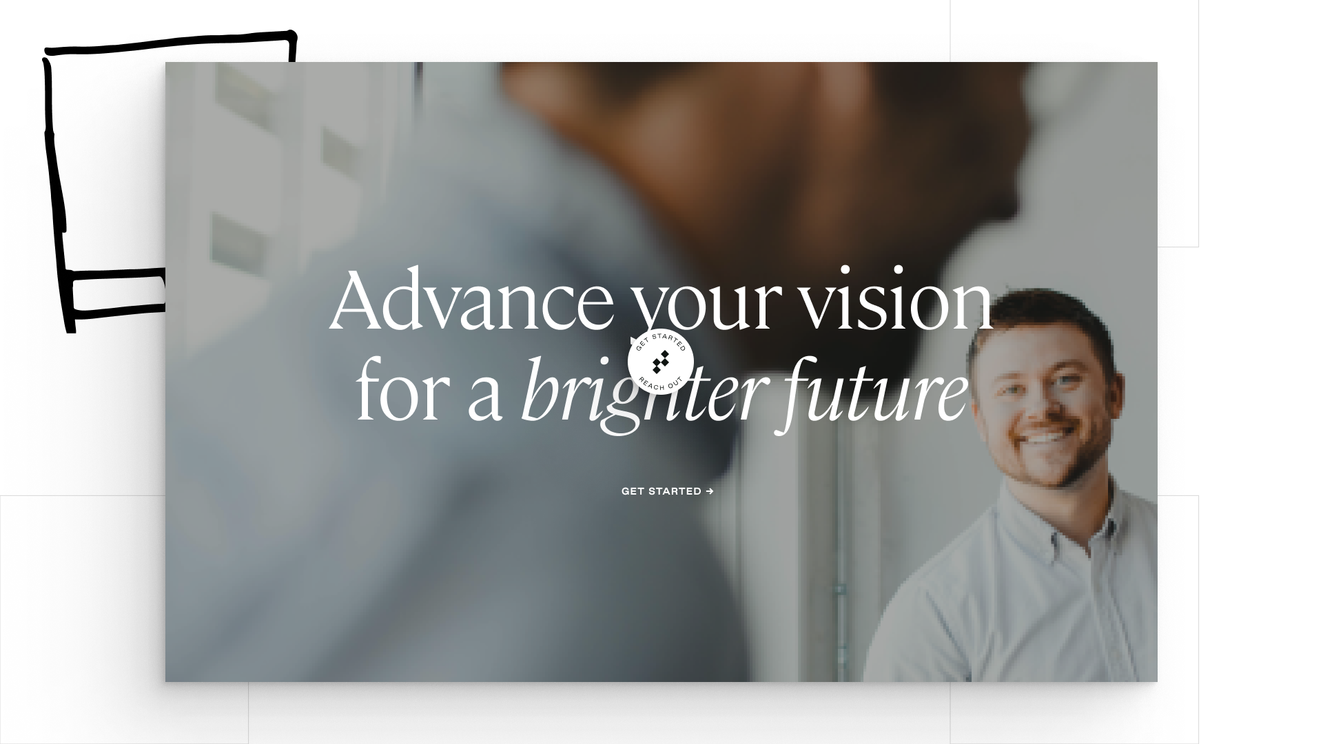
The emphasis of a slower, more exploratory design language was a significant “a-ha” moment for us; previous iterations heavily emphasized action-oriented language and clear, direct calls to action, which didn’t connect well with our perspective and culture. Along the way, we also landed on the “for a brighter future” language that’s used to frame our featured work; a constant reminder that design and copywriting are always connected.
Q: What web technologies, tools, and resources did you use to develop this?
A: For design we principally used Figma — as we do on every project. A little bit of vector work was done with Illustrator, and we did detailed animation work with After Effects, integrated with the site using the Lottie toolset. While we’re also a fluent Wordpress shop, due to our desire to iterate frequently and experiment quickly, we relied heavily on Webflow for interaction design and the development of this site.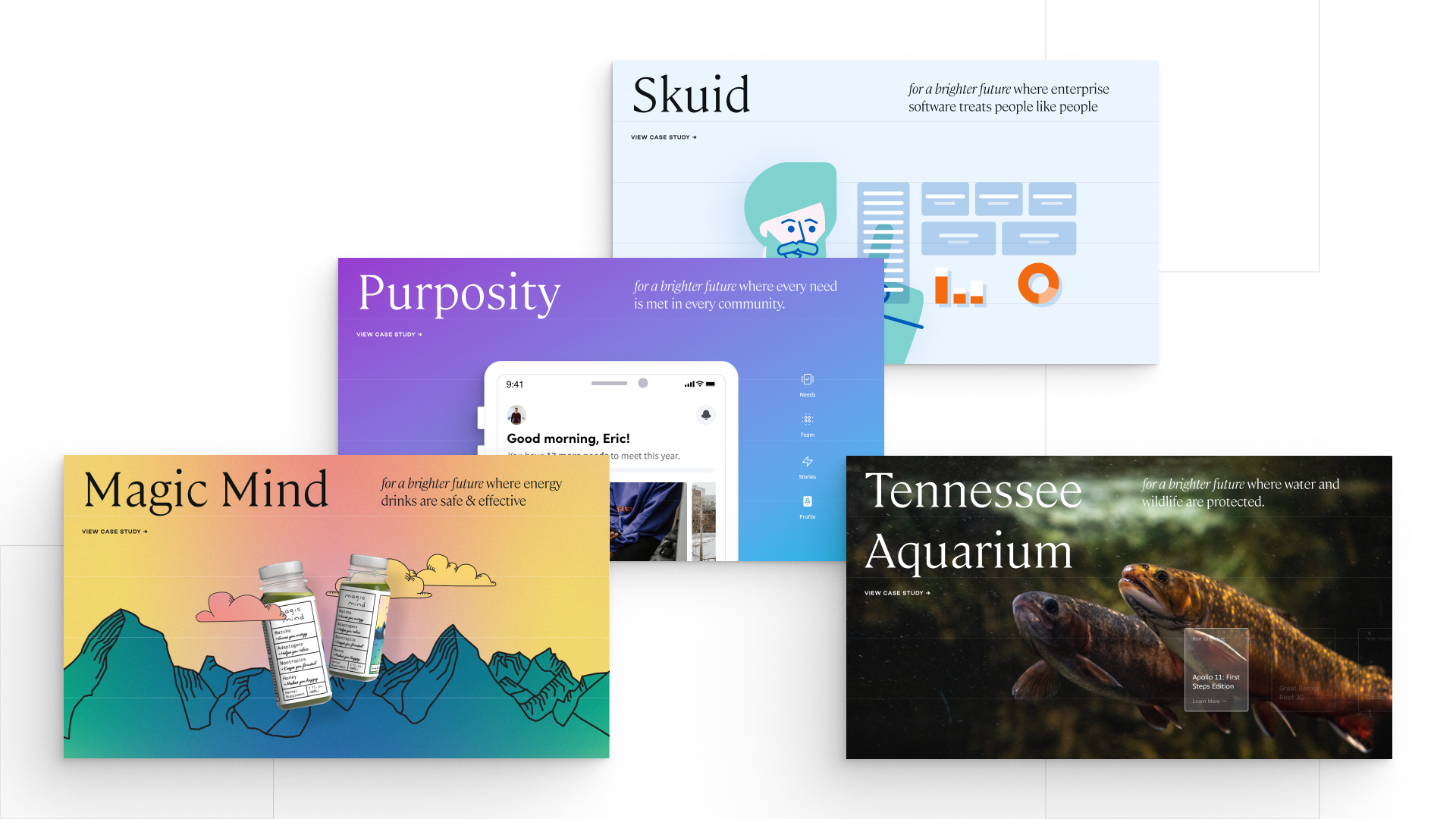
Q: How did you balance your own creative ideas and technical capabilities with a fair representation of the client’s brand?
A: We’re big believers in serving the client’s vision at every turn on a project; a privilege of working with deeply value-aligned partners. We see that collaboration as an opportunity to carry their vision and work in the world a little bit further forward, and our creative ideas and technical capabilities are at their best when we’re working wholeheartedly in pursuit of that vision, not in tension against it.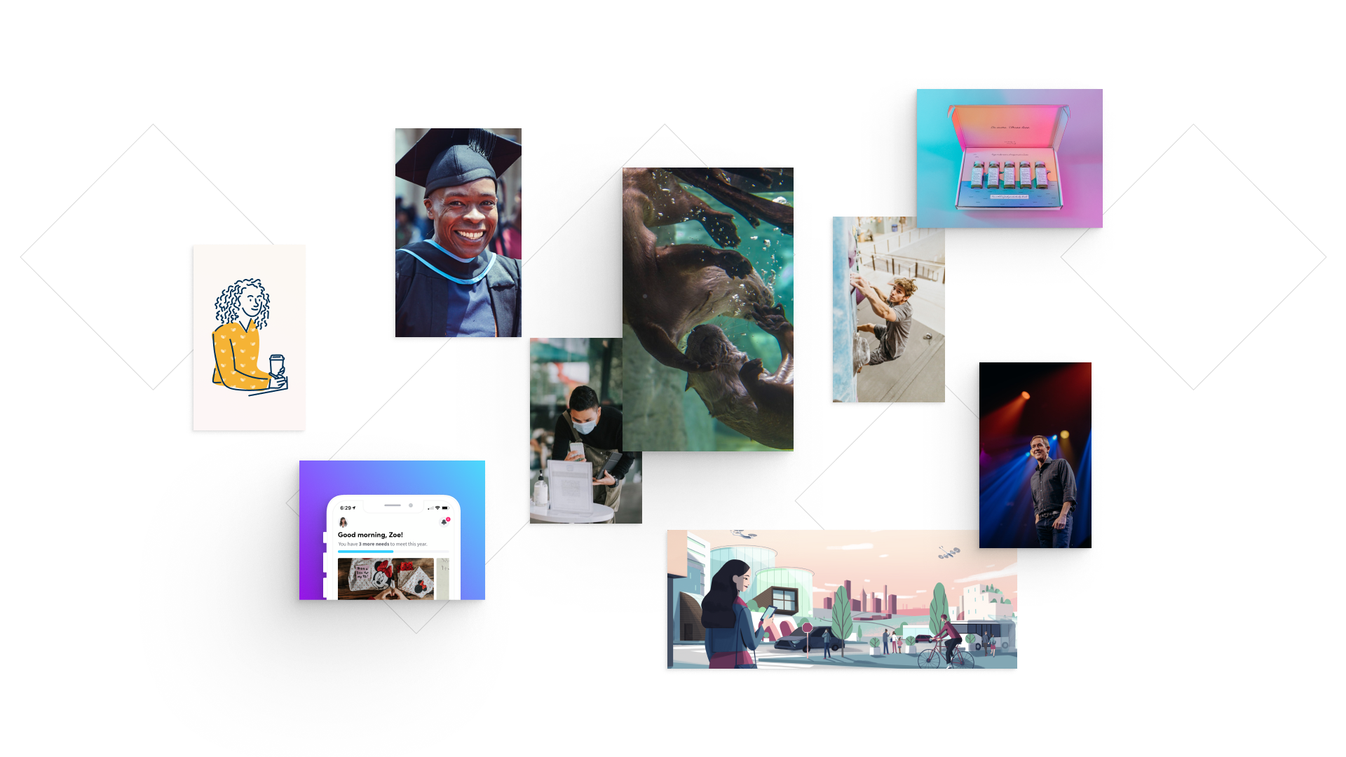
Q: How did the final product meet or exceed your expectations?
A: Honestly, we would hesitate to call it final! It’s always a bit of a work in progress or, to quote one of our designers, in “perpetual beta.” What it did most successfully is help us to rally around a concise way to talk about our work — and continues to serve as a compass for our broader brand as it continues to evolve.