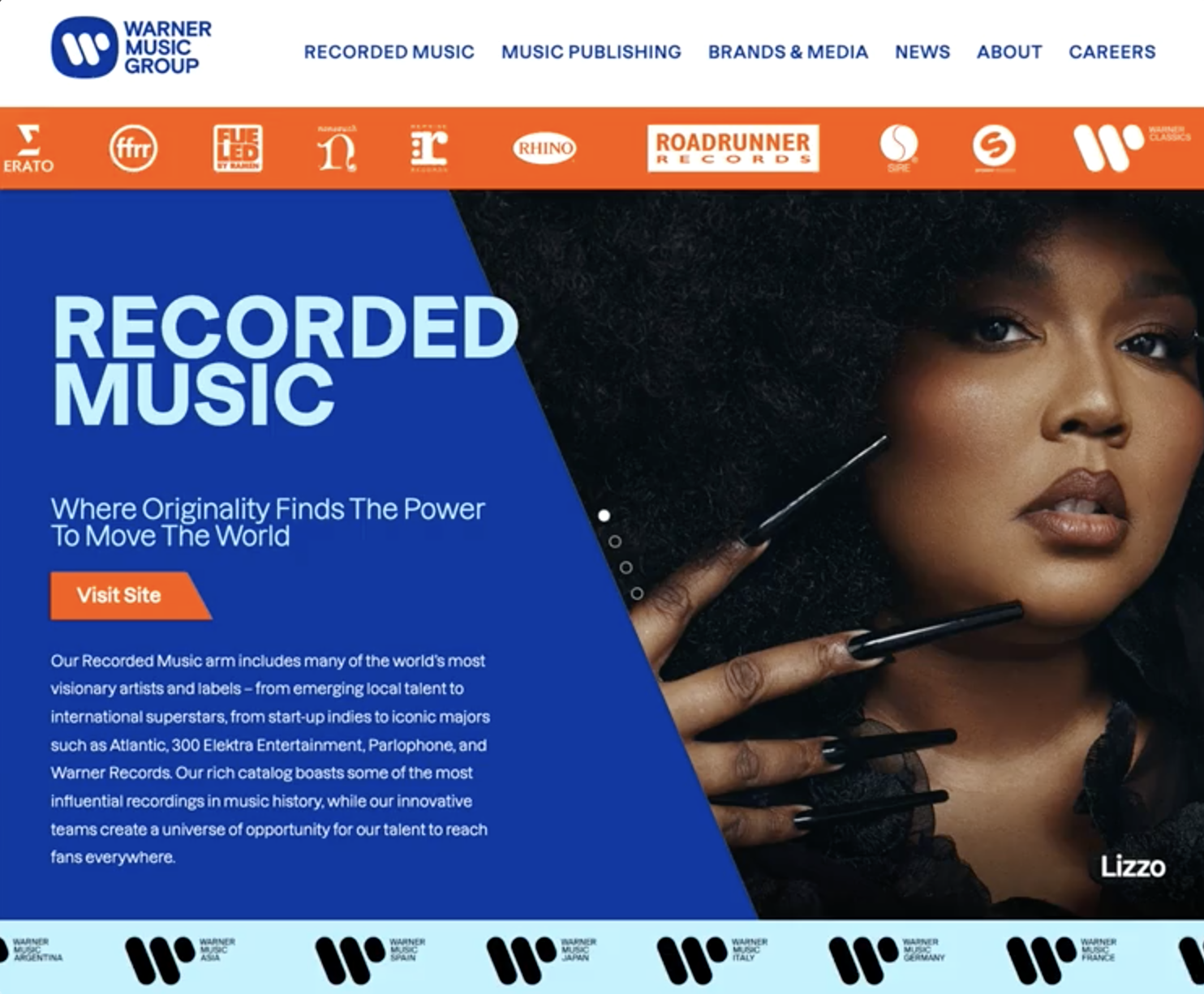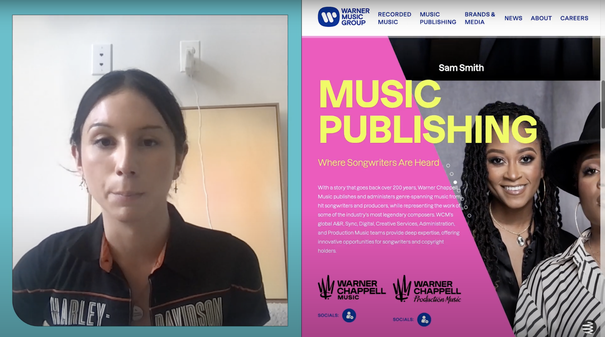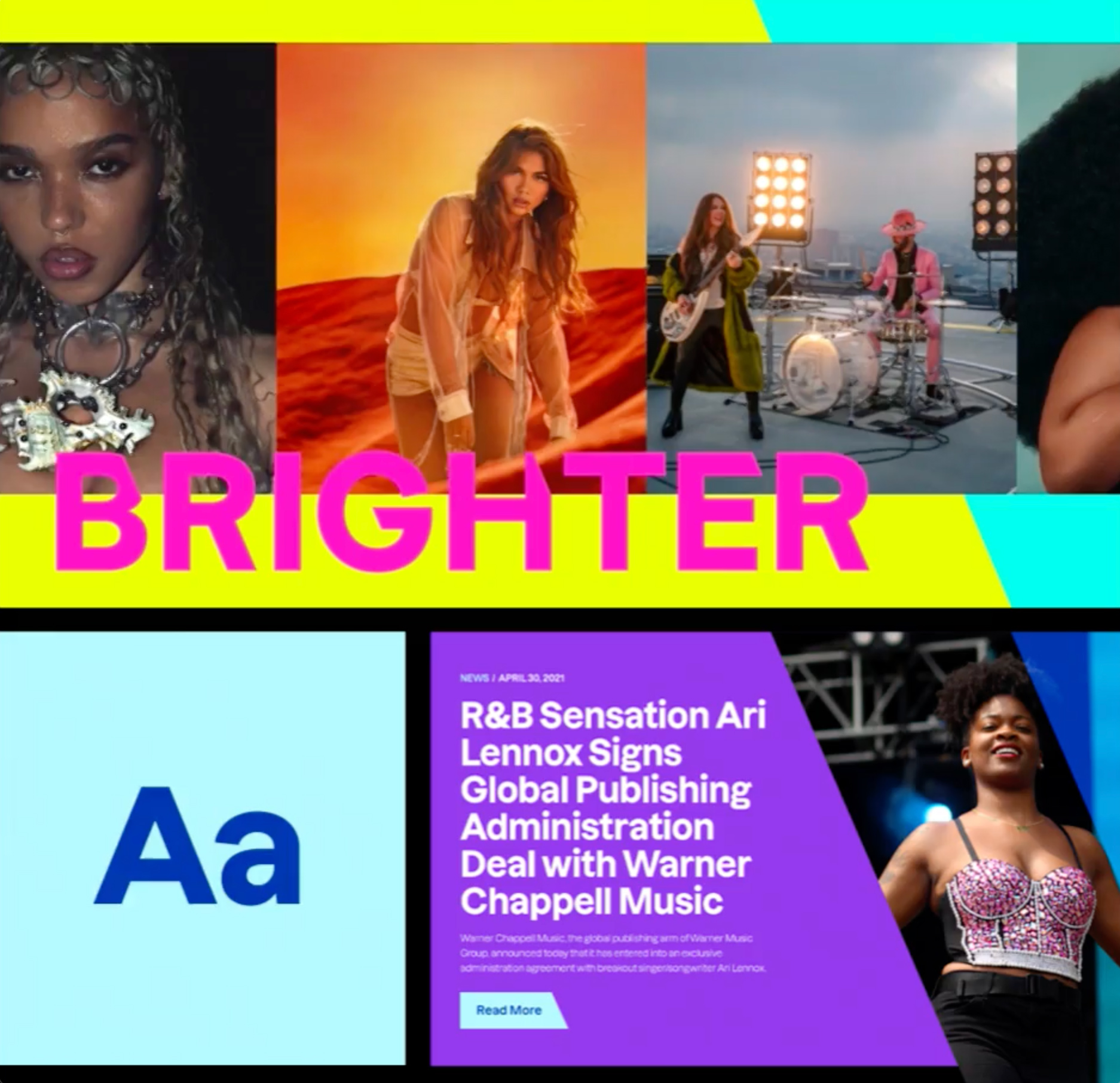
A new brand identity came with many specifics on how the organization's story should be toldAdam Scher, Co-founder & Creative Director
CMYK


Q: Once you settled on your idea, what influenced your decision on the chosen technical approach? How did it differ or go beyond approaches you’ve taken in the past?
A: An experiential approach to web design is one that focuses on creating an immersive and engaging experience for users. This was achieved through the use of interactive elements, thoughtful approaches to multimedia content, and animated storytelling that allows users to interact with the website in a more meaningful way. Our approach, influenced by storytelling and narrative devices, let us break with conventions of a traditional homepage scroll.
Q: What were some of your biggest learning and takeaways from this project?
A: Experiential and narrative approaches to web design and site architecture can be a great way to engage users and create a more memorable experience. However, it is important to make sure that these approaches do not come at the expense of usability. We tempered experiential touchpoints with functional tools for navigation and interface operation that created an environment that was unconventional, but still simple to move through.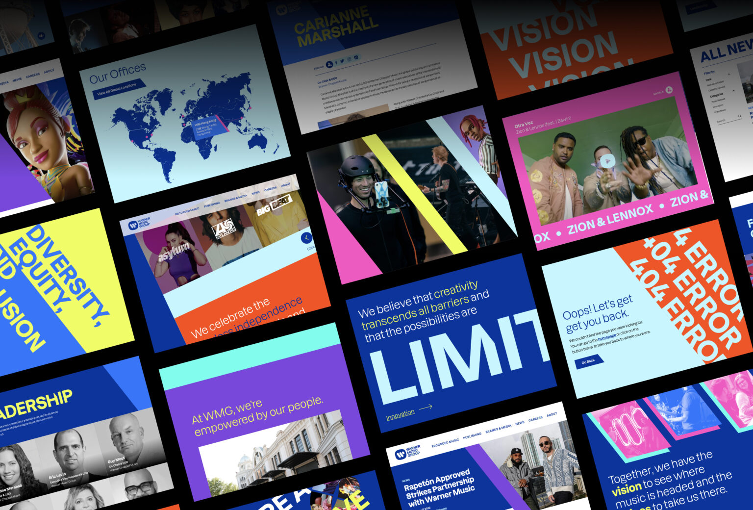
Q: How did the final product meet or exceed your expectations? What results did you see?
A: Session rates and conversions increased markedly from the update. Anecdotally, users felt a clearer understanding of the organization's vision- and new design frameworks for its various initiatives helped newcomers identify the brand, its offerings, and its values.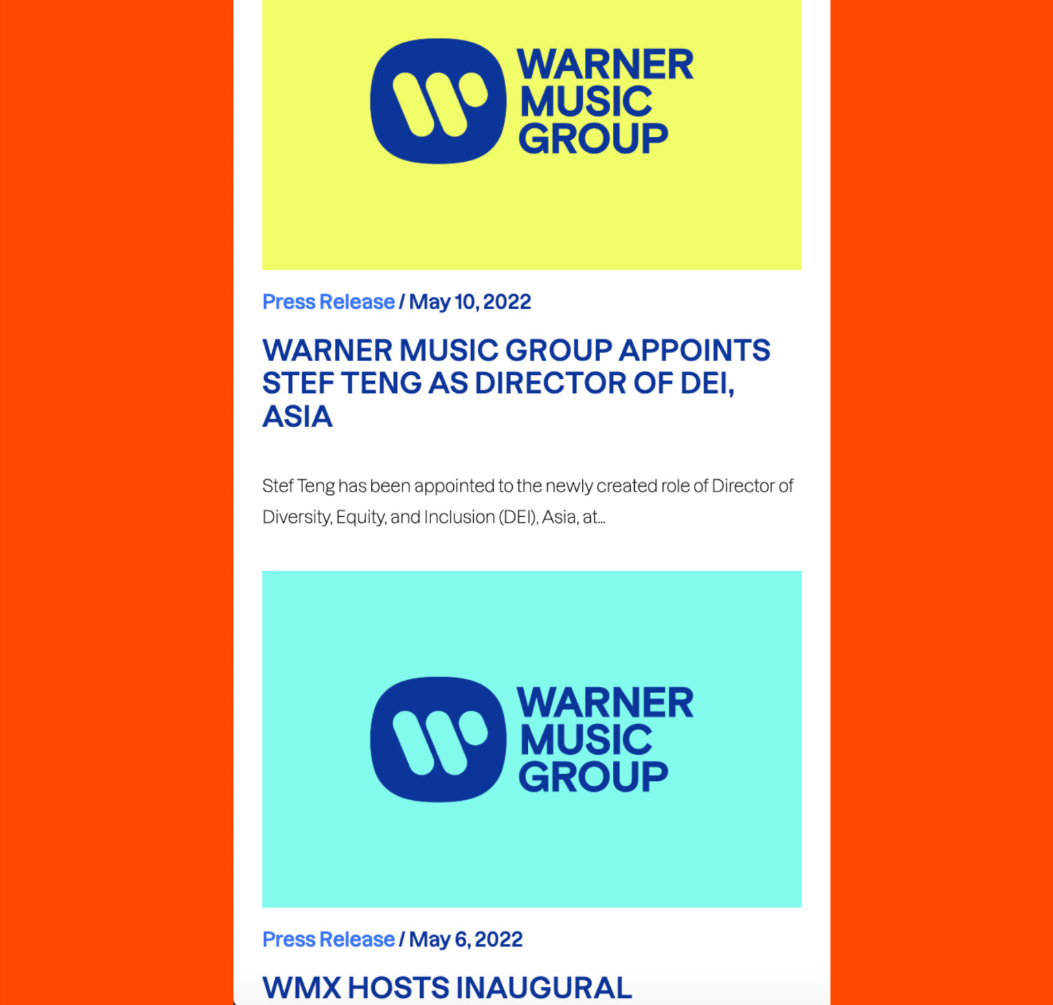
Q: Why is this an exciting time to create new digital experiences? How does your team fit into this?
A: New technologies are emerging all the time, opening up new possibilities for creating digital experiences. The increasing popularity of mobile-first solutions also creates a compelling, challenging problem space for digital storytellers, which we love to channel creatively. As new tools become available to create more personal experiences for users, we're challenged to answer new and unprecedented questions driven by intersectionality and empathy.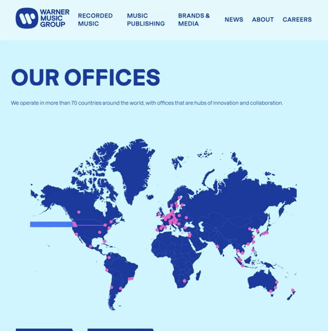
Q: How did you reach a good balance of your own creative ideas and technical capabilities with a fair representation of the client’s brand?
A: We want to create something that is both visually appealing and on-brand - while also technically feasible and viable to sometimes competing interests. We achieve this chiefly through open, honest, and empathetic communication. We like to see our clients as collaborators, and invite them into many stages of the design and development process.