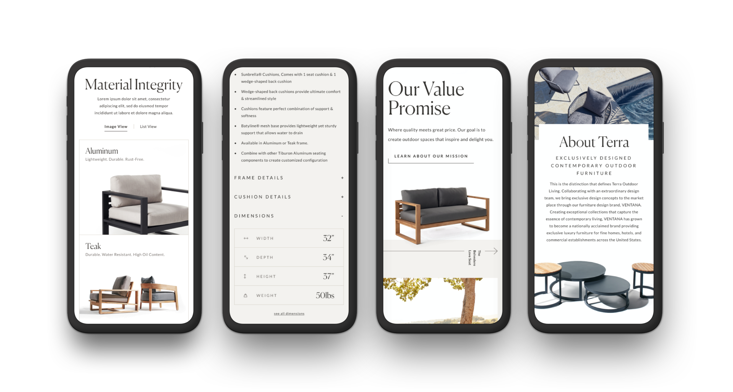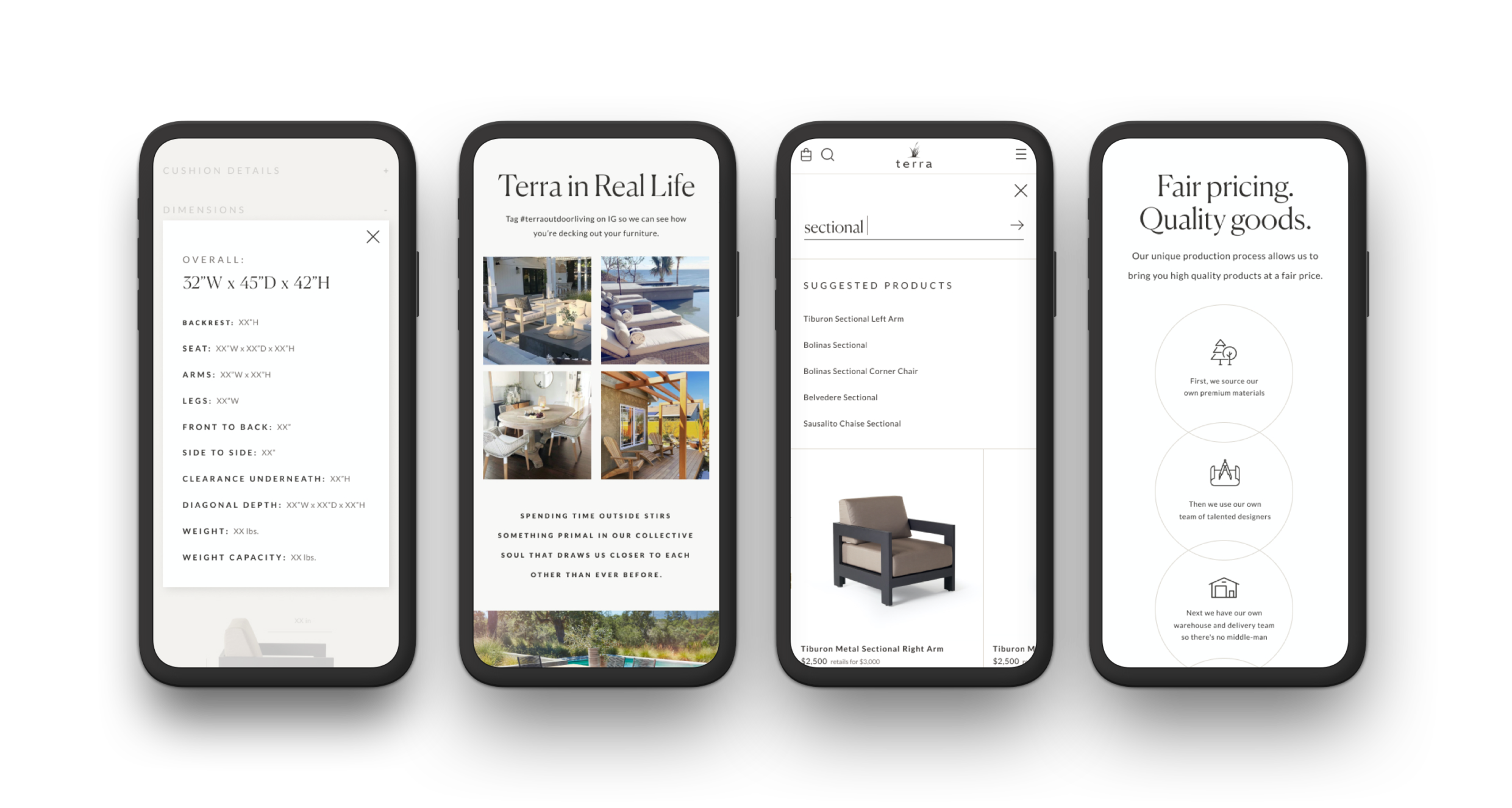
"The emphasis on work like ours — building brand and business narratives through a results-driven channel like eCommerce — has never been greater. And the appetite for clients wanting to leverage experience design as a crucial brand and business differentiator has never been stronger."Pattern Team

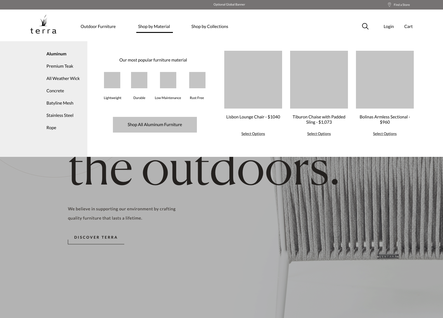
Q: Tell us about your initial moodboard, wireframe, or prototype. How did things change throughout the process?
A: Early on we explored multiple expressions for the Terra brand via UX design, content flows and visual explorations — we leaned into luxury, fashion, modern editorial design and expressive motion. Wireframes were crafted to provide structure, a systematic backbone and to quickly iterate on design hierarchy, user flows and features. Visual design played up the elevated brand language with the result being a perfect balance of utility and luxury.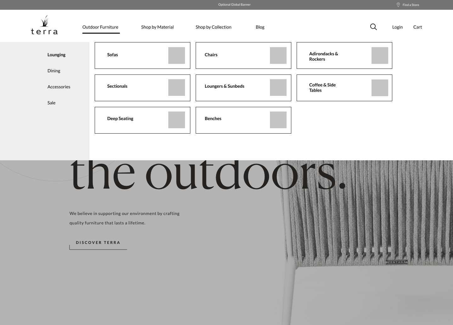
Q: What influenced your chosen technical approach, and how did it go beyond past methods?
A: Terra needed more control and flexibility in how they ran the day-to-day online business and over the curated, guided and elevated experience they wanted to deliver online to customers (who often make multiple trips to the store and site before committing to a purchase). Our deep expertise in pushing the boundaries of both design and code with Shopify made it the obvious choice for a replatform and redesign.When did you experience a breakthrough or an "a-ha" moment during this project?
We had a few. One of the first was the idea that we could create navigation paths that go beyond product categories and into things like shopping by material or style. Another was the notion that the site sometimes isn't just a sales tool — it’s also a guidance and research tool sitting within a user journey that can span weeks of in-store visits, online research, mood boarding, space planning and cart comparing.
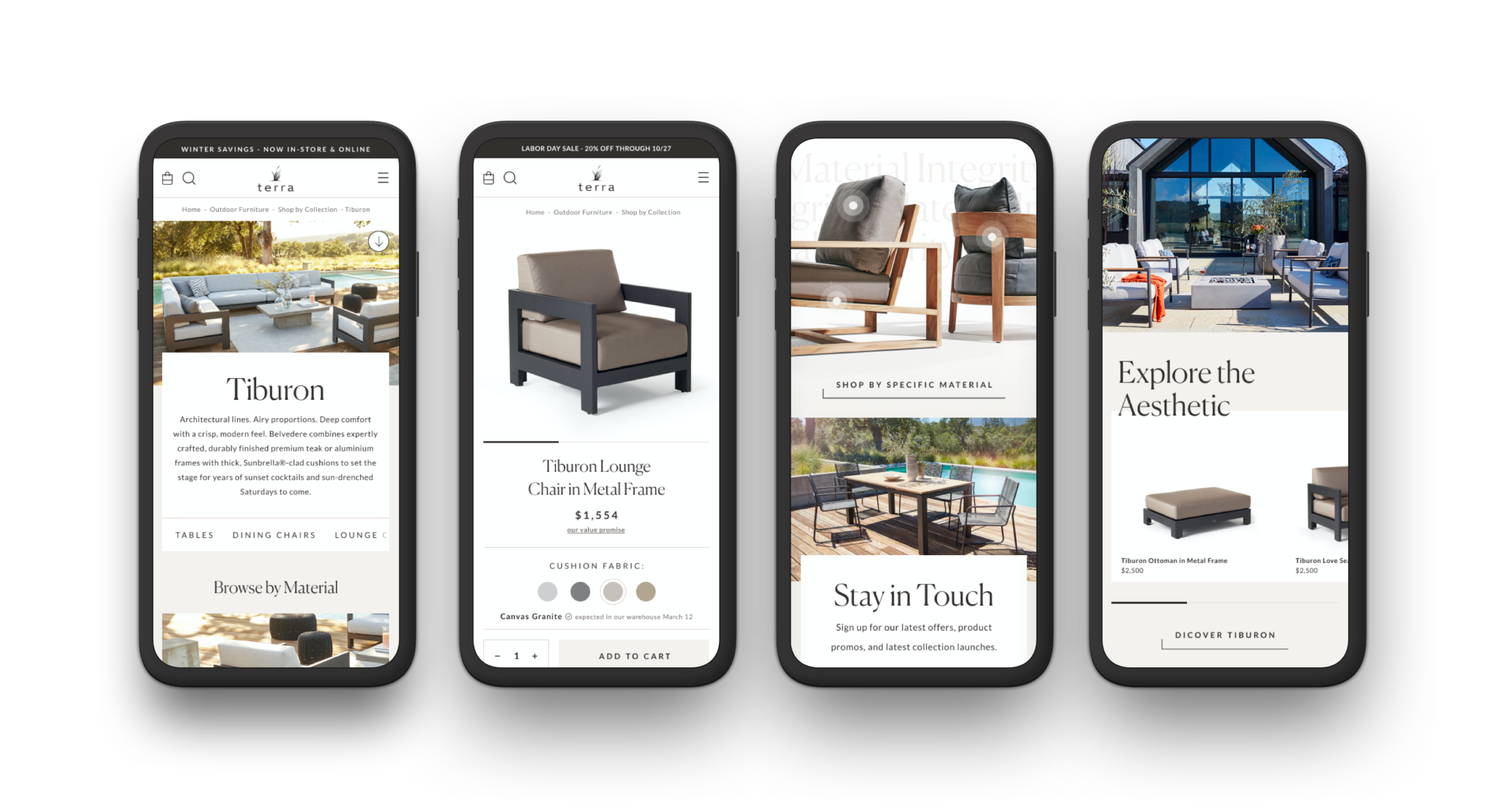
Q: What web technologies, tools, and resources did you use to develop this?
A: With our tech partners at Presidio, we crafted the experience as a custom theme within Shopify utilizing a core suite of technology that includes Shopify Plus, GraphQL, React & Node, Github Actions, Lighthouse CI. All of the UX and visual design was executed within Figma and motion prototypes were built out in Principle.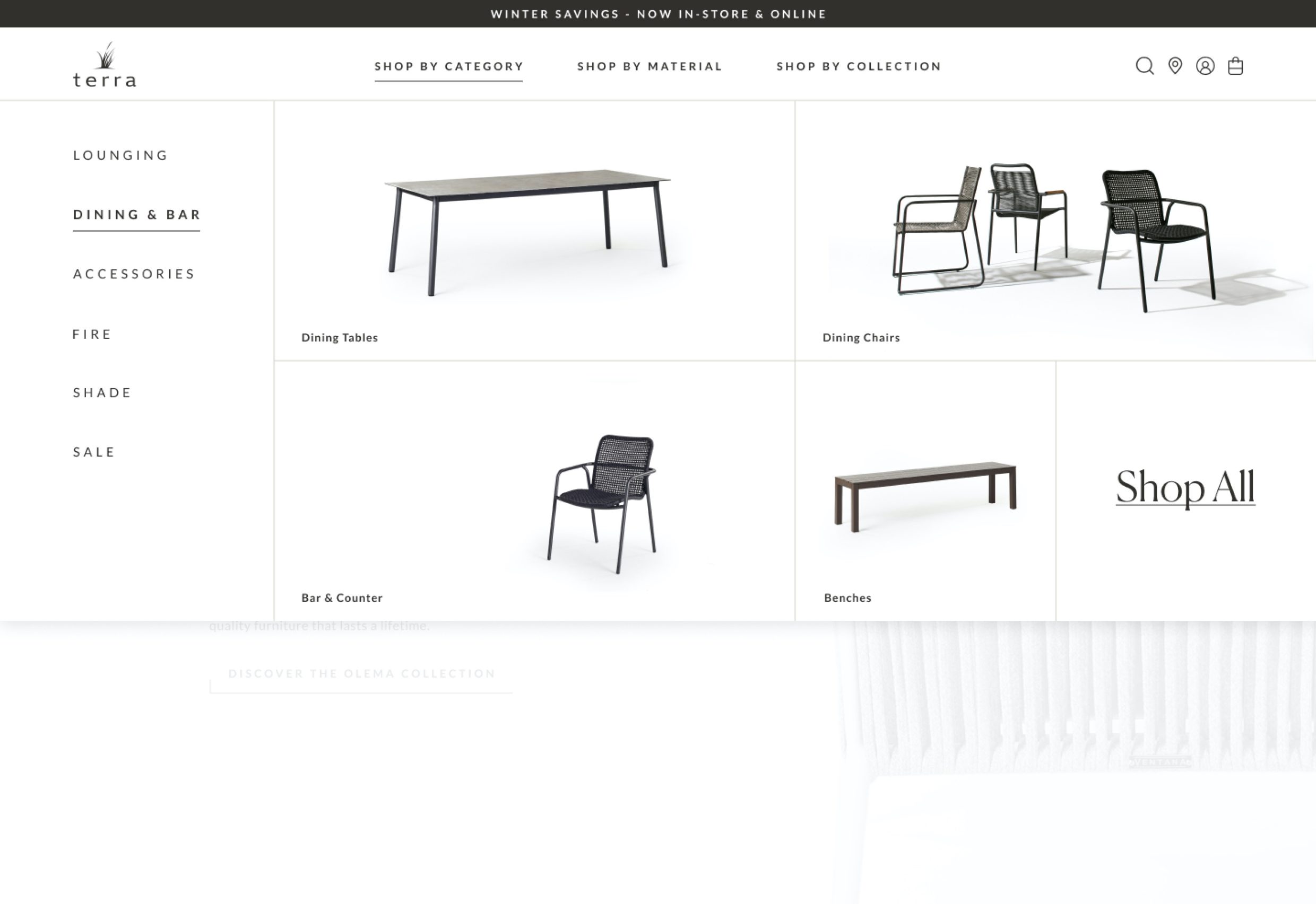
Q: How did you balance your own creative ideas and technical capabilities with a fair representation of the client’s brand?
A: Given that most of our work is in the eCommerce space, our team has become really adept at pushing creative UX and visual ideas early on in the process. We then methodically revise them until they hit a point of balance between expressive and memorable interactions on the customer experience side, while being structured and systematic and scalable on the backend. Finding the right balance is a core component of our overall design process.