Basement studio
MrBeast
A saturated, interactive, performant storefront
MrBeast
A saturated, interactive, performant storefront
Fashion & Beauty /
People's Voice Winner
Building a creative storefront that handled 1M active users and 170K store checkouts on launch day.Jose Rago, Co-founder at basement studio

Q: Once you settled on your idea, what influenced your decision on the chosen technical approach? How did it differ or go beyond approaches you’ve taken in the past?
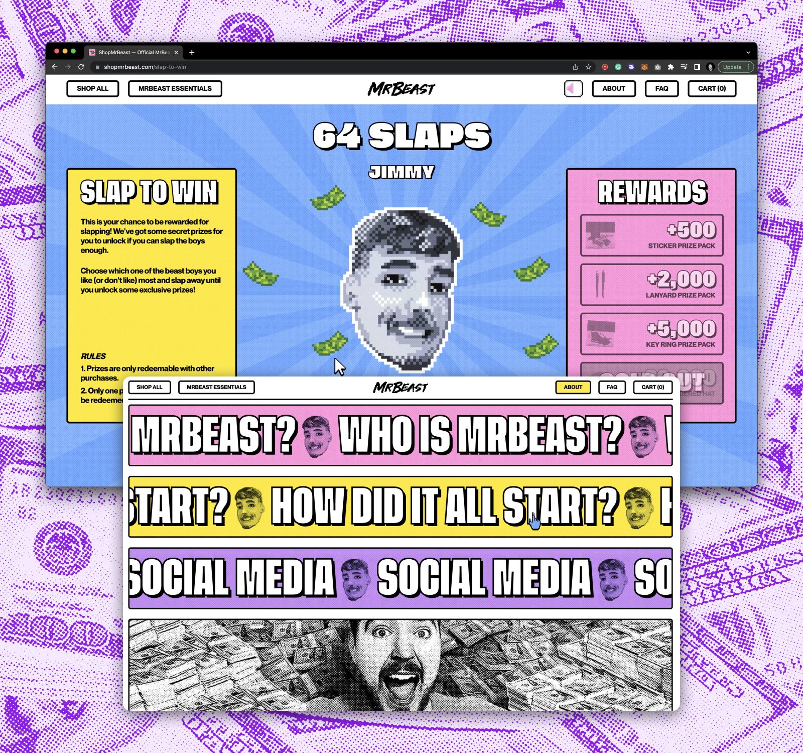
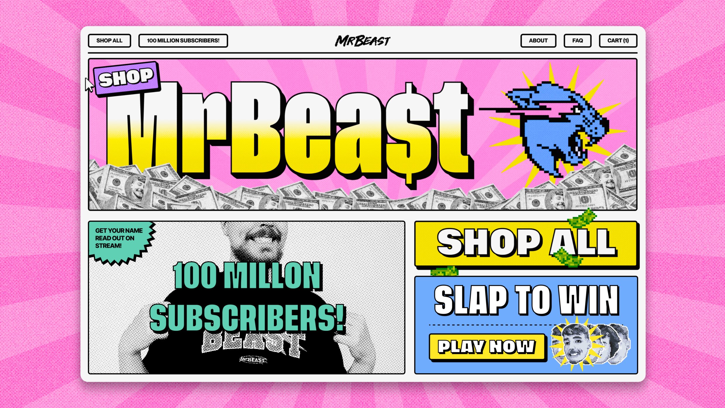
A: We needed to balance entertainment with performance, but this time exponentially. The MrBeast site has many animations, custom scrolling, media assets, and even built-in games. It also expected millions of users worldwide, with more than half of them landing the site from a mobile device, so it was a must to monitor everything happening on the website at all times.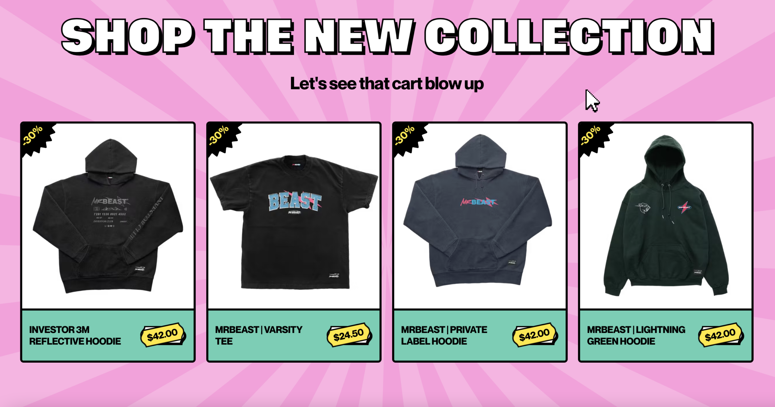
Q: What were some of your biggest learning and takeaways from this project?
A: This project represents our motto: team size doesn't matter when it comes to scale like crazy. As a small but dedicated studio that obsesses over choosing the right tools, we were able to test our flexibility and move lightning-fast to get the job done. No matter the challenge, we don't settle until we make cool shit that performs. We're more ready than ever to go above and beyond, always willing to walk a couple more miles just for fun.
Q: What web technologies, approaches, tools, or resources did you use to develop this experience (WordPress, headless, AI, Sublime Text, HTML5, Adobe XD, etc)?
A: As part of our stellar stack, Vercel and Next.js ensure our end-user performance expectations. On the commerce side, Shopify gave us everything we needed. In addition to its broad suite of features, we leveraged its Storefront API, with a library built by us to connect to it in a type-safe manner. For the game logic, we used plain JavaScript and loaded the code right when the user pressed the “PLAY” button to have the best performance.
Q: How did the final product meet or exceed your expectations? What results did you see?
A: We took performance to a whole new level and set a record on the Vercel platform for the most requested site in a week. We served an audience of 1 million+ unique visitors, around 27+ countries, with 170k+ merchandise sold. We are proud to have handled an extreme cascade of users while providing a great shopping experience. It was a vital milestone for our company, which tested our capabilities and got us ready to scale any project
Q: Why is this an exciting time to create new digital experiences? How does your team fit into this?
A: It's a thrilling time. Technology has accelerated the shift toward digital interactions and experiences, creating an ever-expanding array of tools and platforms to innovate and delight. We have the chance to craft experiences that are both impactful and transformative. The current landscape is replete with endless prospects for creativity and innovation, beckoning creators to forge ahead and blaze new trails in the realm of digital experiences.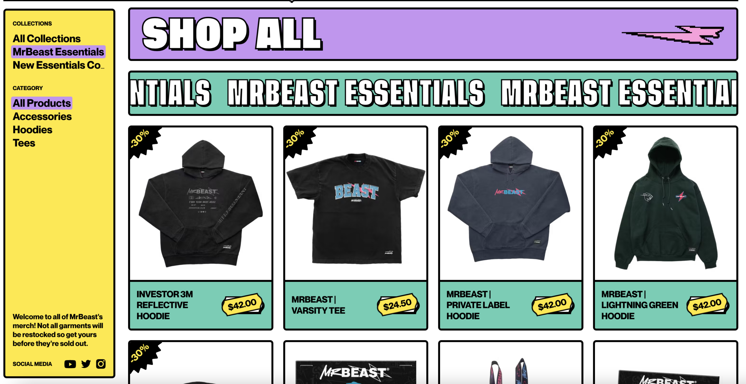
Q: How did you reach a good balance of your own creative ideas and technical capabilities with a fair representation of the client’s brand?
A: MrBeast’s iconic personality and extravagance allowed us unlimited room for creativity. We got the chance to build a masterpiece and reveal some of the deepest ideas from the darks of basement studio. MrBeast wanted his users to have fun, so in addition to an epic store, we added a layer of entertainment with fun mini-games that unlocked hidden perks and discounts for shoppers. This was a perfect way to engage visitors while directing them to buy.