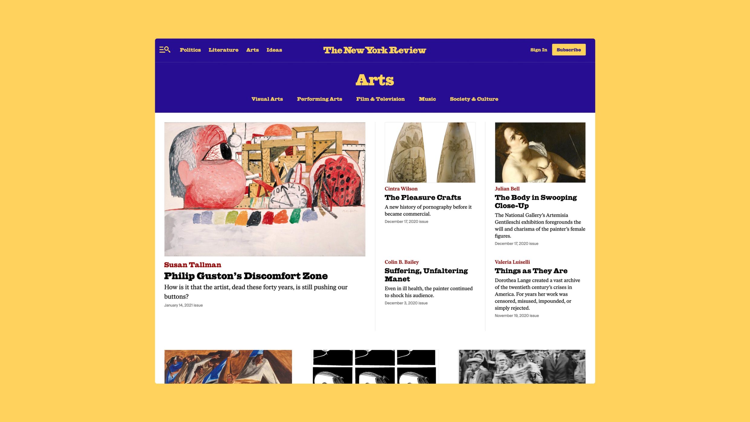
We wanted to see the Review evolve from a website to a platform and, as such, empower their team to drive engagement and growth. This involved favoring solutions that provided the Review the right amount of options and control.- Athletics Team

Q: Tell us about your initial moodboard, wireframe, or prototype. How did things change throughout the process?
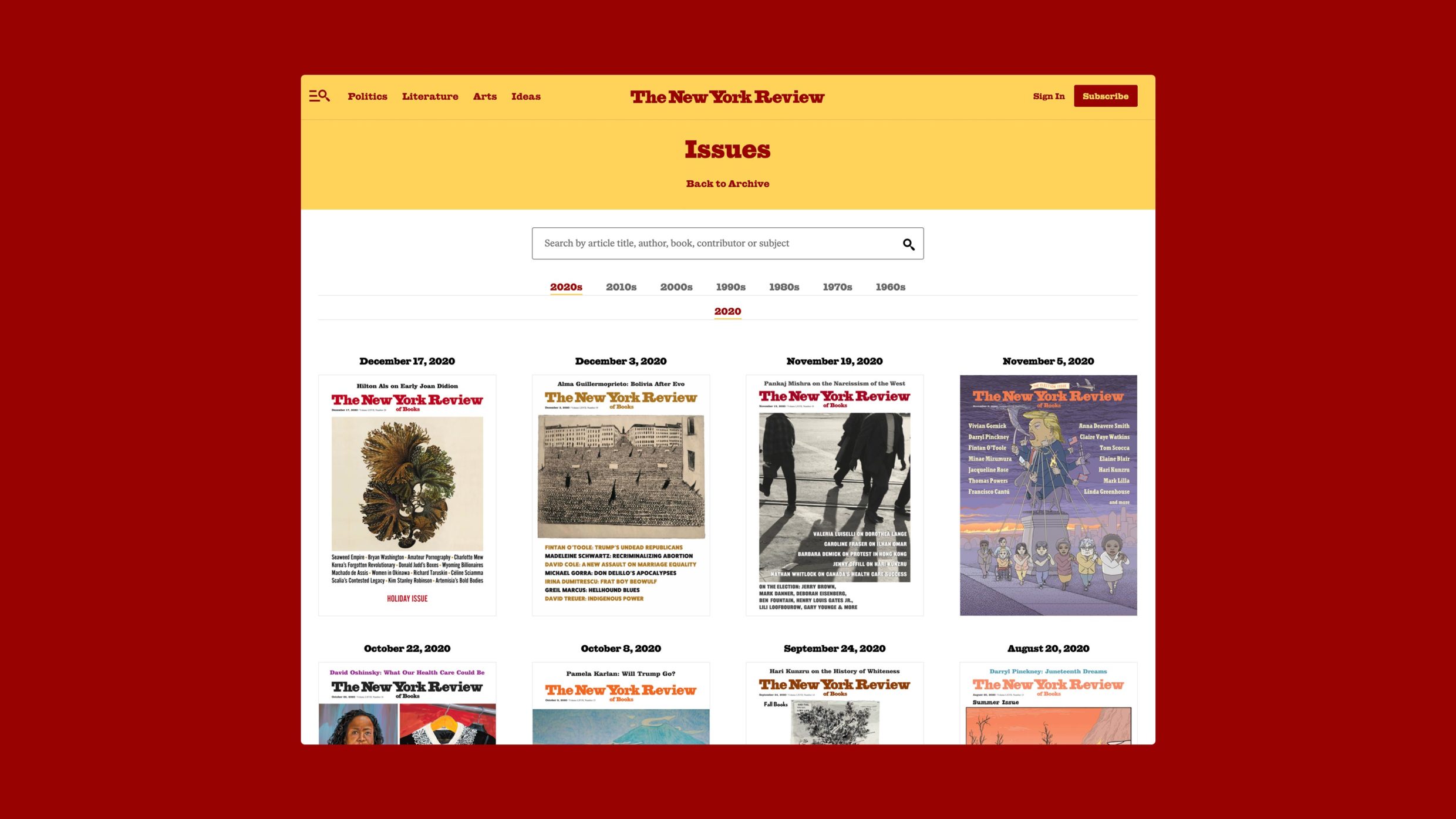
A: Our initial moodboards consisted of partial page sketches, each taking different cues from the Review's rich history of magazine covers. The direction we took borrowed from the colorful cut-and-paste style covers from the 70s. While some key ideas such as color pairs and our "digital cover" stuck, other elements became simplified and more structured as the design progressed to keep a clean and uninterrupted reading experience.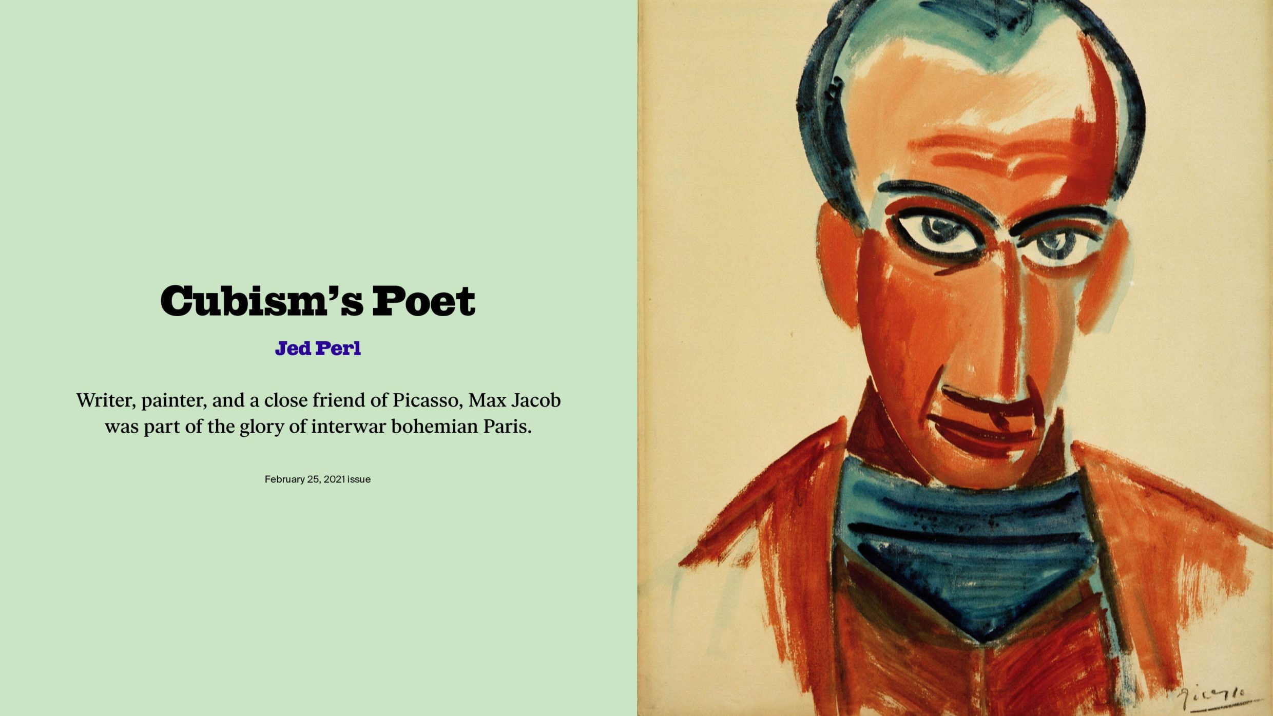
Q: What influenced your chosen technical approach, and how did it go beyond past methods?
A: Our technical approach was directly informed by our mission statement — part of which was "to create a modern product platform for The New York Review that attracts subscribers diverse in age, ethnicity, and gender." We wanted to see the Review evolve from a website to a platform and, as such, empower their team to drive engagement and growth. This involved favoring solutions that provided the Review the right amount of options and control.When did you experience a breakthrough or an "a-ha" moment during this project?
We realized early on that a key part of achieving our goal to attract a younger and more diverse audience for The Review was to give more opportunities for someone to learn who and what The Review is. This prioritized ideas around discovery such as introducing categories to the site, creating content collections that could group content around more flexible themes, and introducing a metered paywall rather than one based around the print issue.
Q: What web technologies, tools, and resources did you use to develop this?
A: One of the approaches we're most excited about is bringing in Swiftype along with the SearchUI React library to create a robust search experience in a traditional WordPress site. This solution serves both existing and prospective audiences by making The Review's 50+ year archive easy and intuitive to explore. Other technologies and tools used include Figma, the Tower Git Client, Twig via the Timber plugin, Visual Studio Code, and so many more.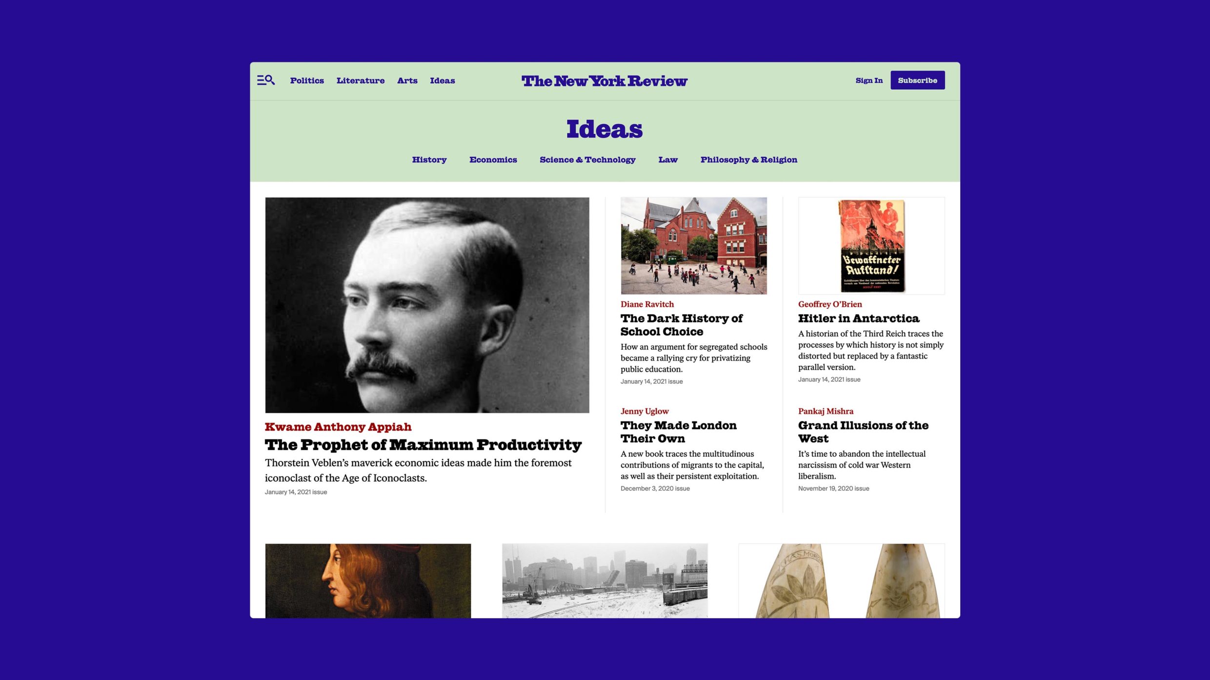
Q: How did the final product meet or exceed your expectations?
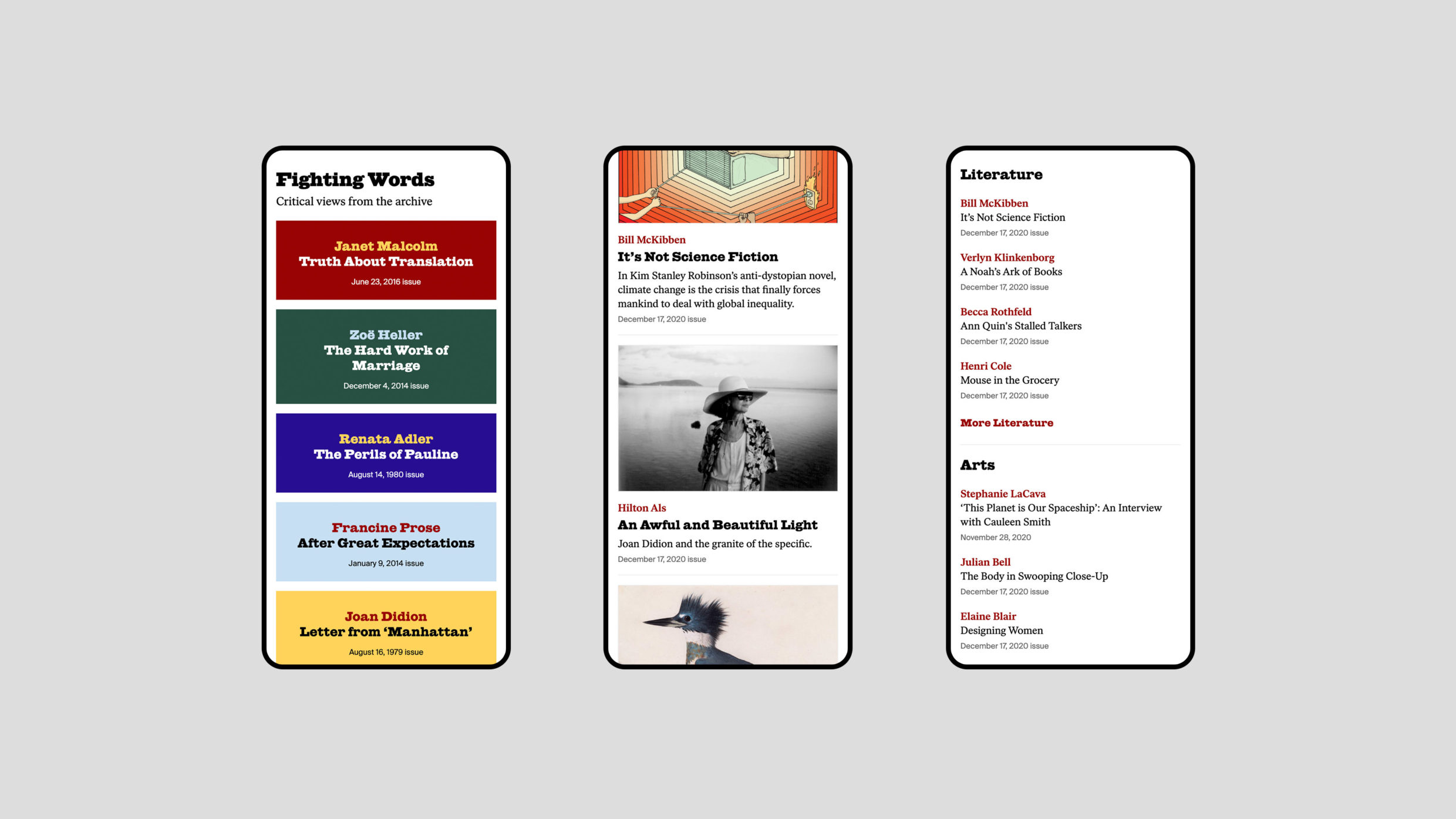
A: On the Review side, it's great to see the team make use of their new tools, changing color pairs to match illustrations and giving life to text-only articles, and using content collections to feature relevant articles from their 58-year archive alongside new pieces. The new design and new paywall implementation more than doubled registrations to their newsletter list and paid subscriptions on the reader and user side.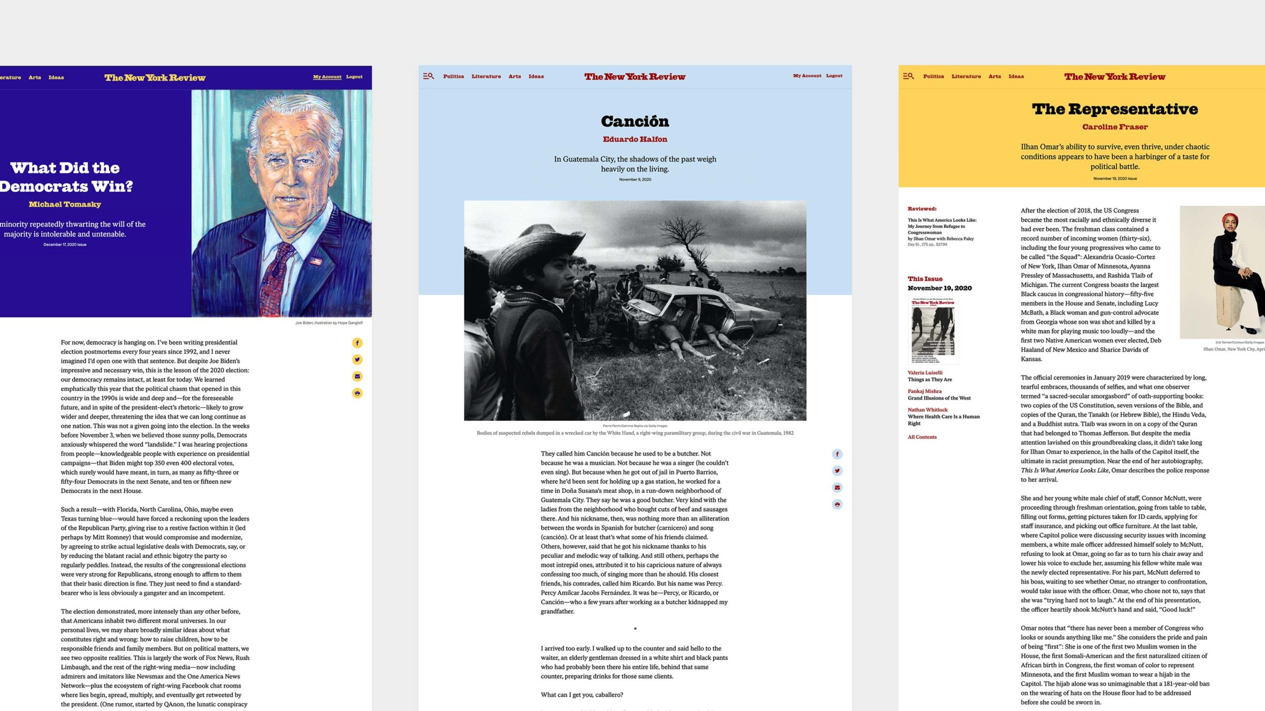
Q: How did you balance your own creative ideas and technical capabilities with a fair representation of the client’s brand?
A: We start the project with an "Experience Definition" document to align on focus areas and create a balance between creative ideas and technical capabilities. On one hand, the document defines user journeys, catalogs modules, pages, and templates needed. On the other, it explores creative opportunities to meet project goals, such as using content collections to surface both current and archival articles.