Media.Monks
Netflix: The Witcher -
Netflix: The Witcher -
Welcome to
the Continent
Best User Experience /
Webby and People's Voice Winner
"From icon design to immersive background music, we designed every detail with the world of the show in mind — there is not a single pixel that we haven’t thought about! As fans ourselves, we needed to match the show’s tone."Media.Monks

Q: Tell us about your initial moodboard, wireframe, or prototype. How did things change throughout the process?
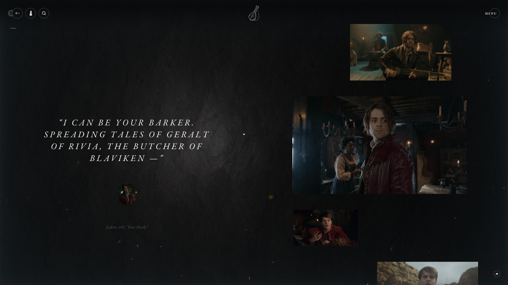
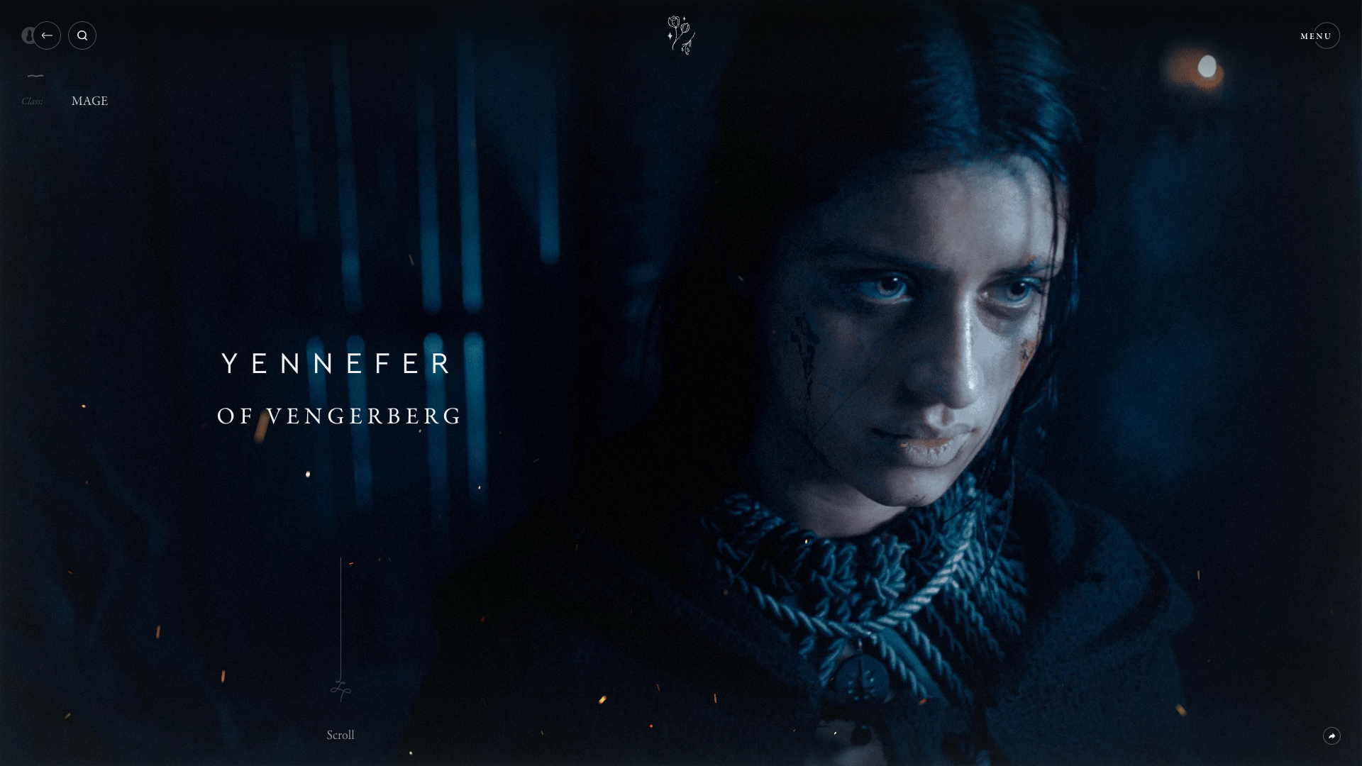
A: We started with our objective: to create a single source of truth for The Witcher. We mapped out the essential elements we needed to embed — a process that led us towards a very functional, even dull, site! With Netflix being the storytellers they are, we knew we needed to weave in a narrative. This shift generated more visually exciting designs, a less conventional UX journey and an immersive storyline that leads you through the entire website.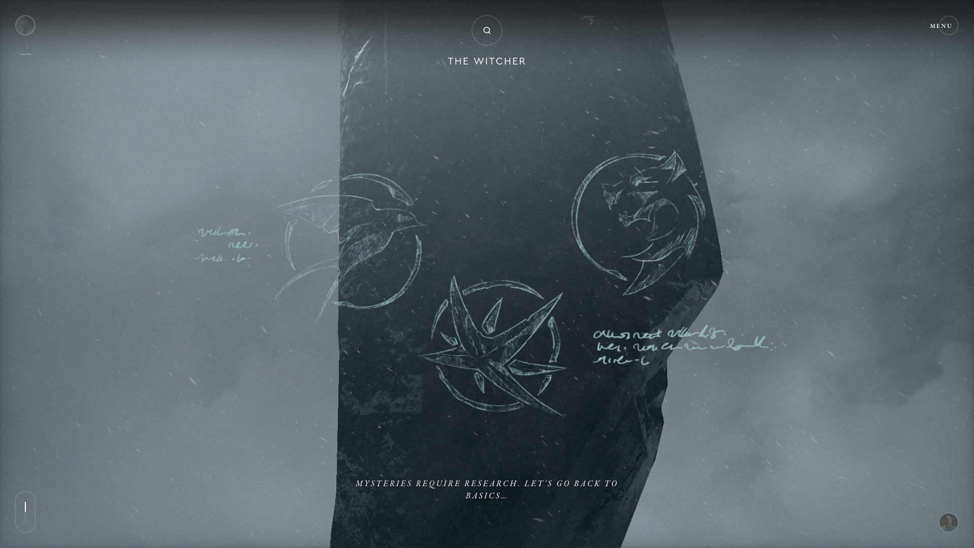
Q: What influenced your chosen technical approach, and how did it go beyond past methods?
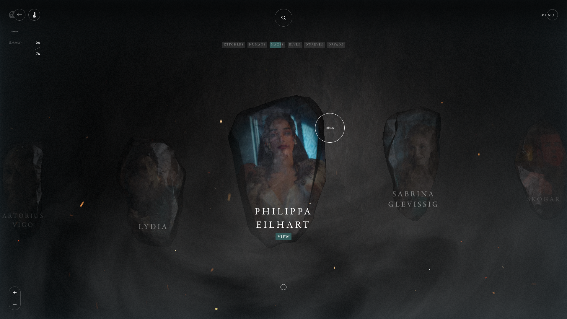
A: Our approach centered on a key consideration: how could we best translate the show experience into a digital world? Typically, a content-heavy site would go down a linear, Wiki-style route. But we knew this wouldn’t honor The Witcher. Instead, we chose an immersive WebGL experience. Our tech team was involved in concepting as every detail needed to align with Witcher lore. Creatives, developers and strategists alike were in the trenches together.When did you experience a breakthrough or an "a-ha" moment during this project?
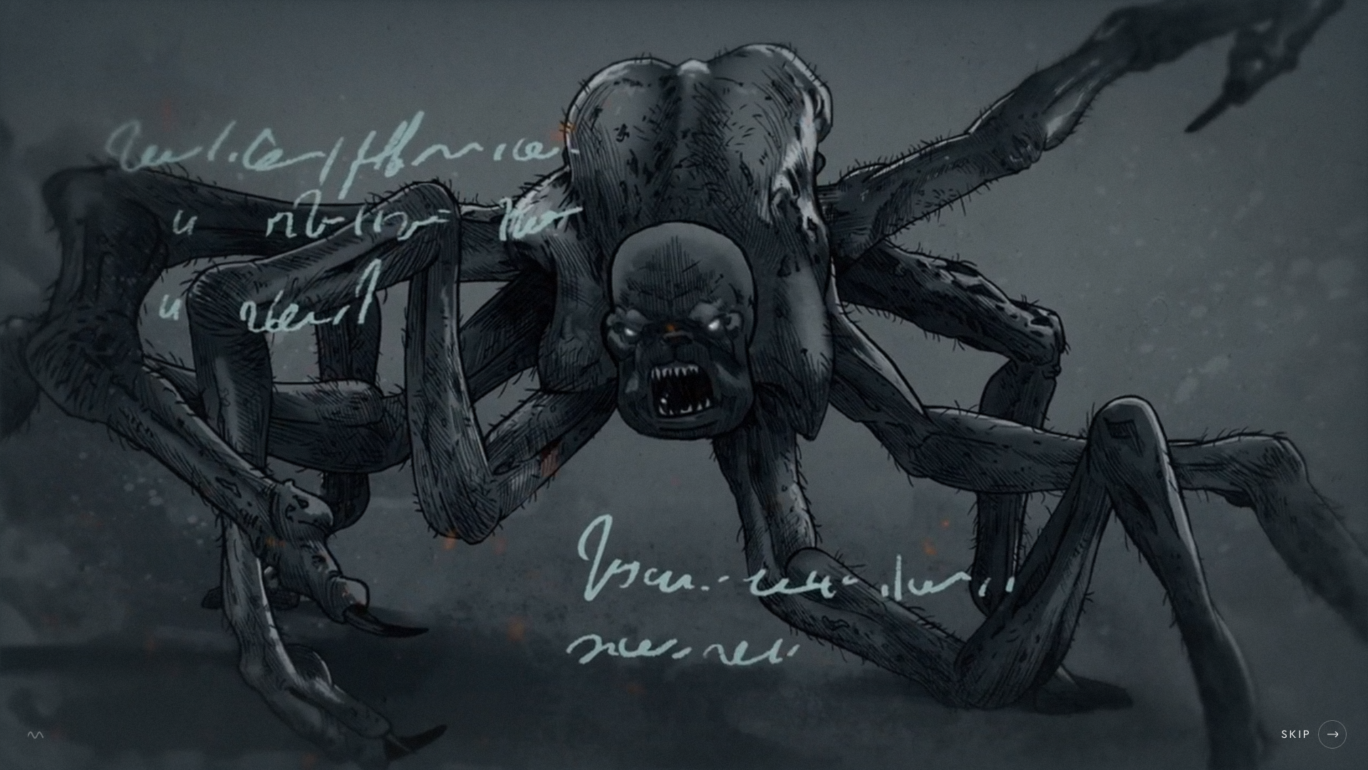
Our “a-ha” moment struck us when we first brainstormed the digital monolith for our landing page. As a key mystery in season two, the monolith adds an essential level of storytelling detail to our site. It was the connective tissue needed to tell a seamless narrative and guide users into the immersive world of the Continent. It made us realize how vital it was to create a fun, storytelling experience rather than a purely functional platform.
Q: What web technologies, tools, and resources did you use to develop this?
A: Our self-built WebGL framework (working in collaboration with our VueJS framework) is at the core of this experience. This technology is used in every area of our site, from our intro to our central monolith hub, and even in the backdrop of our content pages. We also utilized our extensive self-built CMS to create over 250 unique modular content pages. This CMS imported and exported translations, allowing us to support 11 different languages.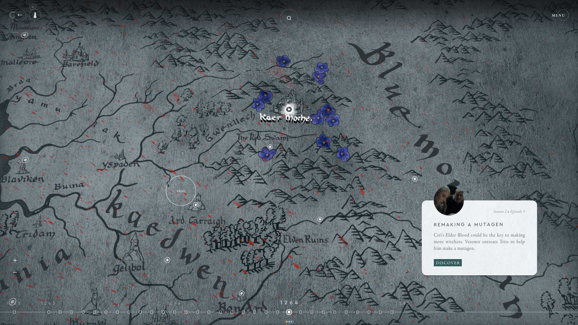
Q: How did you balance your own creative ideas and technical capabilities with a fair representation of the client’s brand?
A: We started by scouting the right talent internally. From concept artists to writers, we chose fantasy enthusiasts who would appreciate the show’s world-building and match the expert knowledge of our clients. Our shared passion (read: geekiness!) created a relationship that felt less like client partner and client and more like a cohesive team. Their high levels of trust allowed us to push the boundaries and do it in a way that respects the brand.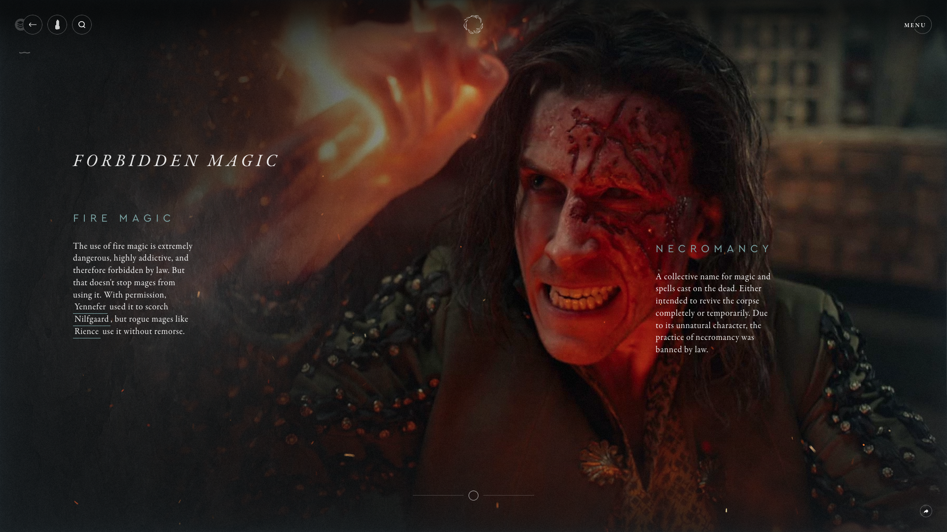
Q: How did the final product meet or exceed your expectations?
A: The in-world detail we achieved in Welcome to the Continent exceeded our expectations. From icon design to immersive background music, we designed every detail with the world of the show in mind — there is not a single pixel that we haven’t thought about! As fans ourselves, we needed to match the show’s tone. This resolve stretched across all disciplines: animation, content, WebGL and strategy all had to be in line and in lore.