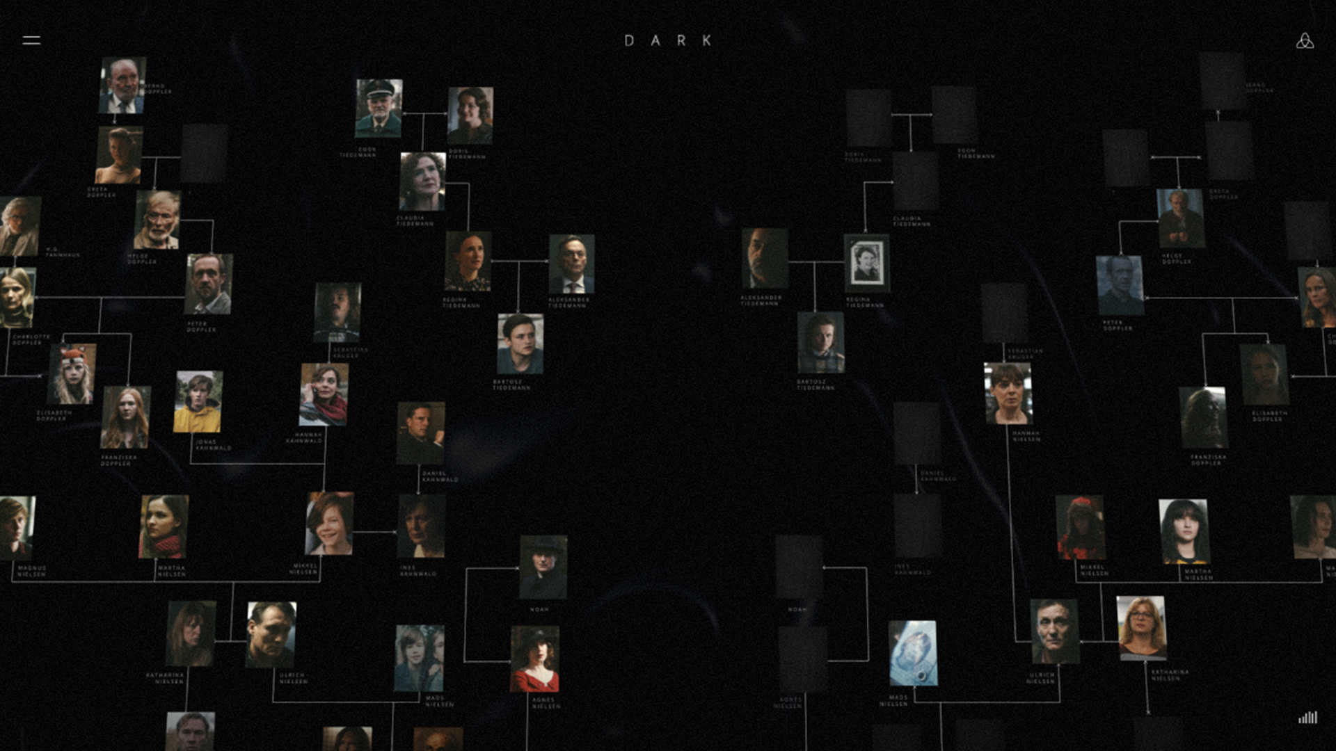
We have not only created a website that is both helpful and visually appealing, but we also translated a complex narrative into an uncomplicated, accessible website for all audiences.- The MediaMonks Team
Q: Tell us about your initial moodboard, wireframe, or prototype. How did things change throughout the process?
A: It did not change much from the initial designs. The imagery and visual style is largely dictated by the series. The design concept was strong and thought out. It slightly evolved during development and with the addition of animation, image transitions, and sound, we managed to make it more immersive.Q: What influenced your chosen technical approach, and how did it go beyond past methods?
A: Graphic elements played a key role in the development. We paid tribute to the show’s look, feel, and storyline, with animated timelines that take the user through the narrative. The overall mood, typography, and kaleidoscopic transitions are inspired by the show’s aesthetics, as well as the eerie music that seals the atmosphere. Once 750 key events were summarized, the show runners double-checked the plethora of content to avoid spoilers.When did you experience a breakthrough or an "a-ha" moment during this project?
It was an immense task to visualize each character’s time travel journey, especially across worlds and making sure that all events displayed correctly. We tried multiple concepts and eventually found a way that worked across all characters. It was a great joint-effort between Henrik & Sofia and the MediaMonks development team.

