The new platform supercharged the earning power of the gallery, streamlining all transactions.Bonnie MacTavish, Head of Experience Strategy


Q: Once you settled on your idea, what influenced your decision on the chosen technical approach? How did it differ or go beyond approaches you’ve taken in the past?
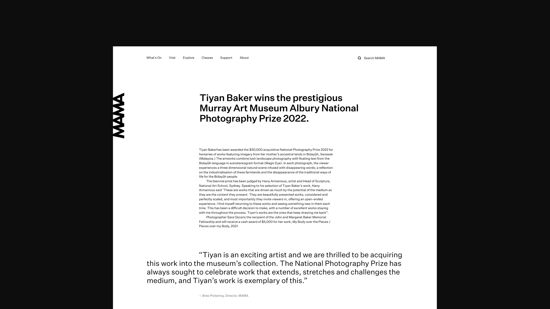
A: We used our usual headless stack to enable maximum flexibility as the gallery’s needs evolved. However, there were several unique features MAMA required that needed bespoke solutions. We engineered an API-driven event calendar to surface topical content, fully controlled within the CMS. We also integrated a platform new to us, Roller, to handle purchases through the site (gift store & art course supplies) as well as event ticketing.
Q: What web technologies, approaches, tools, or resources did you use to develop this experience (WordPress, headless, AI, Sublime Text, HTML5, Adobe XD, etc)?
A: The MAMA site uses next.js as our front-end framework, along with Sanity as the CMS. A headless, static approach results in a blazing fast site for users, and it’s also an incredible dev and content authoring experience. We’re also using GSAP for animations, Jotai for state management, Stripe & Vercel serverless functions for donations and purchases.
Q: How did the final product meet or exceed your expectations? What results did you see?
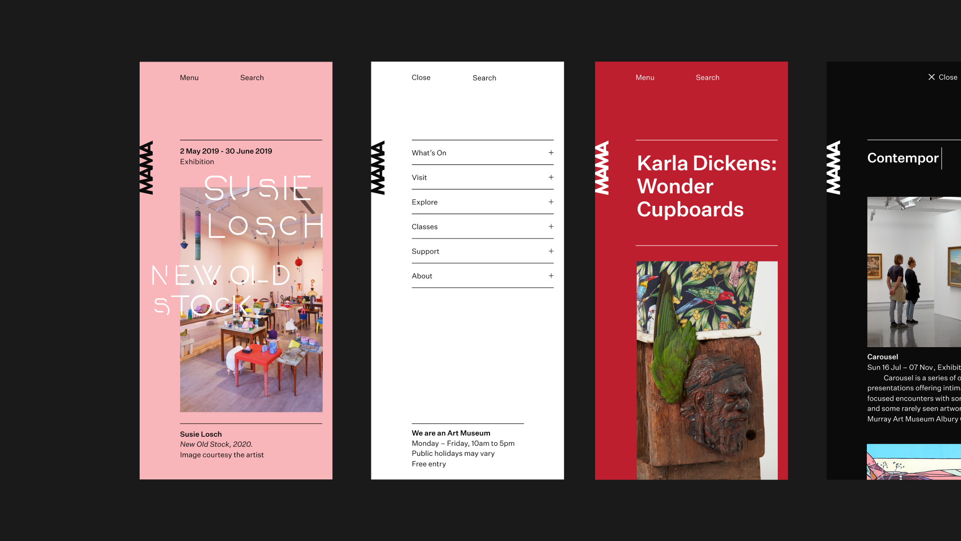
A: We always wanted to create elements of playfulness within the very structured site, so the homepage & featured Exhibition pages are a real achievement. We took the hero image & overlaid bespoke typography created for each exhibition as an SVG, then incorporated coloured backgrounds to create a moment of real impact. What’s more, we built this capability into the CMS, so content editors could easily replicate, with the CMS auto-selecting colors.

