DD.NYC®
Ms. Foundation
Power is us women, together.
Ms. Foundation
Women of Vision Gala
Power is us women, together.
General Websites and Mobile Sites - Events /
Nominee
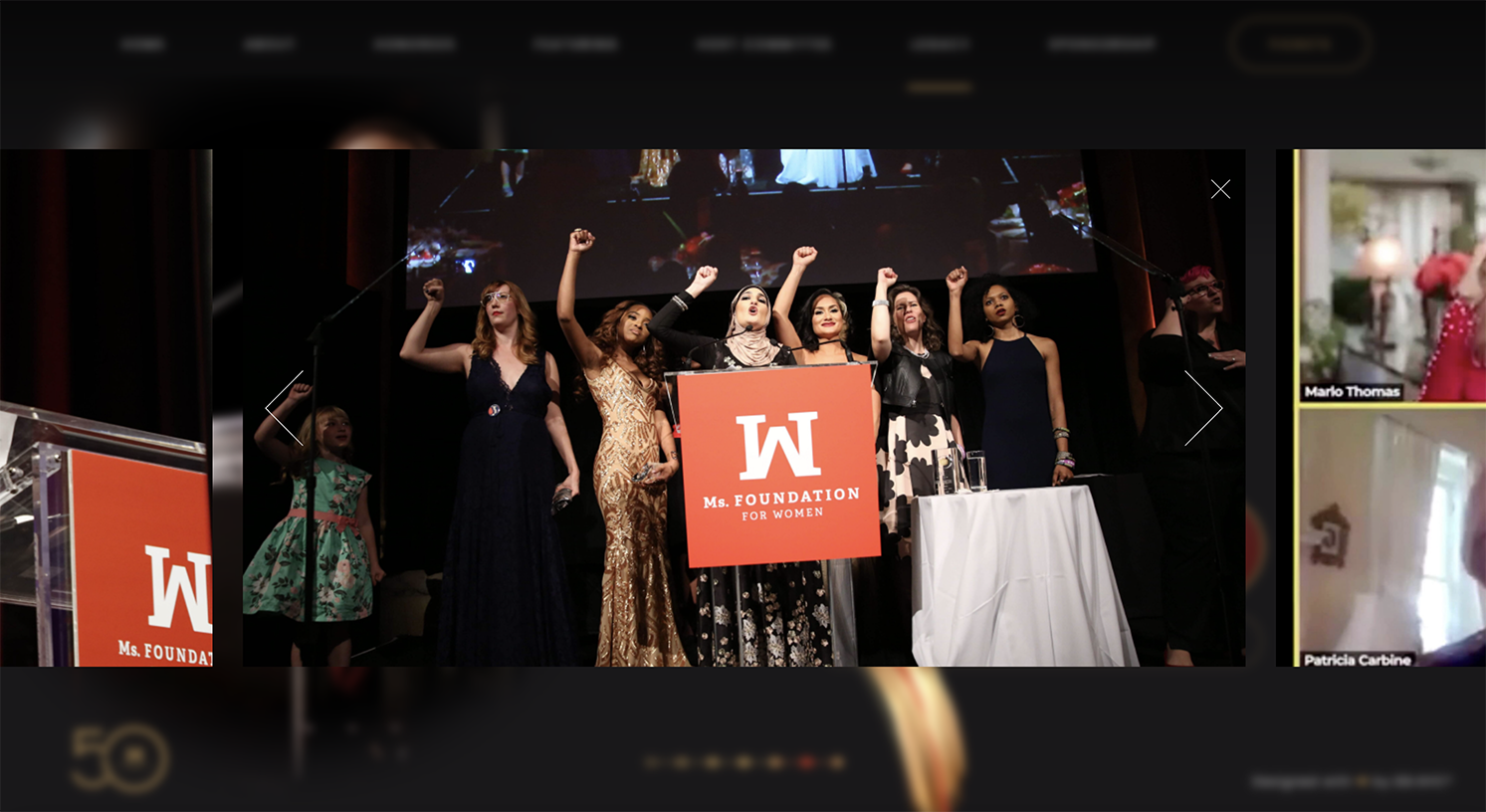
The Ms. Foundation DD.NYC® website allows the mission to go beyond the Ziegfeld ballroom globally.Anjelika Kour, Managing Director


Q: Once you settled on your idea, what influenced your decision on the chosen technical approach? How did it differ or go beyond approaches you’ve taken in the past?
A: The key challenge of the WOV2023.org website was that it had to be fast loading and render while maintaining high design caliber and 3D animations. Our approach in the website development was to write as little code and make the CSS as light as possible for optimized load time and continuous animation on any portion of your horizontal scroll experience. We were able to achieve this with a CSS file under 30 kbs and other video optimizations throughout.
Q: What were some of your biggest learning and takeaways from this project?
A: Working under a highly aggressive timeline as the big news about Meghan Markle's recognition was to be announced, our team created the highly sophisticated and animated website in sheer days to facilitate Ms. Foundation's mission and spread the news about the event and its mission past the Ziegfeld ballroom walls globally. The website has had an incredible spike in traffic from the launch date and has been mentioned by news networks globally.
Q: What web technologies, approaches, tools, or resources did you use to develop this experience (WordPress, headless, AI, Sublime Text, HTML5, Adobe XD, etc)?
A: This website is using little to no code, with an ultra light CSS file of under 20 kbs, little to no WordPress and is powered by the WP Engine's FlyWheel system for ultra-fast hosting. The design was created in Figma with a combination of animated 3D elements exported from Blender and turned into light video and gif files for further optimization of speed and excellence of user experience.
Q: How did the final product meet or exceed your expectations? What results did you see?
A: The result is spectacular. The website is a labor of love, unique and celebratory in nature, and has been recognized by various outlets such as Website of the Day, nominated for several larger awards, and mentioned by media channels worldwide. The response to the design has been tremendous and the traffic continues to grow.
Q: Why is this an exciting time to create new digital experiences? How does your team fit into this?
A: This is an exciting time to create a truly remarkable digital experience as we are living in the age of AI where simple digital experiences can be realized without the use of a living creative mind. A website like the one realized for the Ms. Foundation 50th Anniversary Gala is a true testament to the need of a human creative to create something unique and special with a lot of philosophy behind each and every element on the page.
Q: How did you reach a good balance of your own creative ideas and technical capabilities with a fair representation of the client’s brand?
A: As we were also the creatives behind the Ms. Foundation's 50th Anniversary Brand - the creation of the digital assets in conjunction with all of the assets we are creating for the event - was a holistic approach. Concepts and creative ideas, technical capabilities, and visualizations were all formed in one room at one time to deliver a truly global vision for the execution of the project.
