Build in Amsterdam
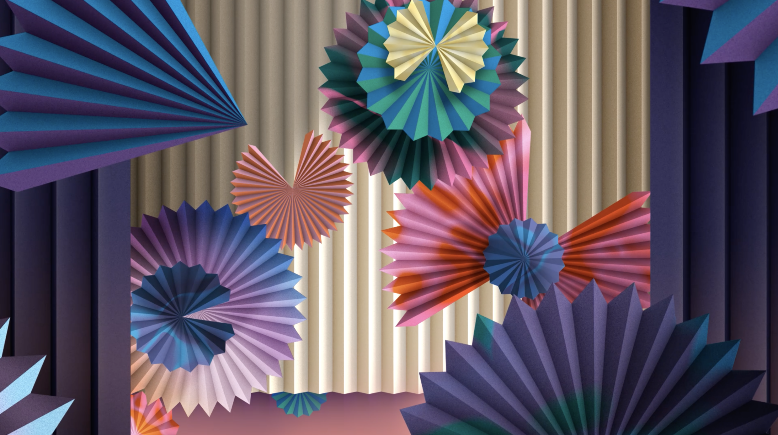
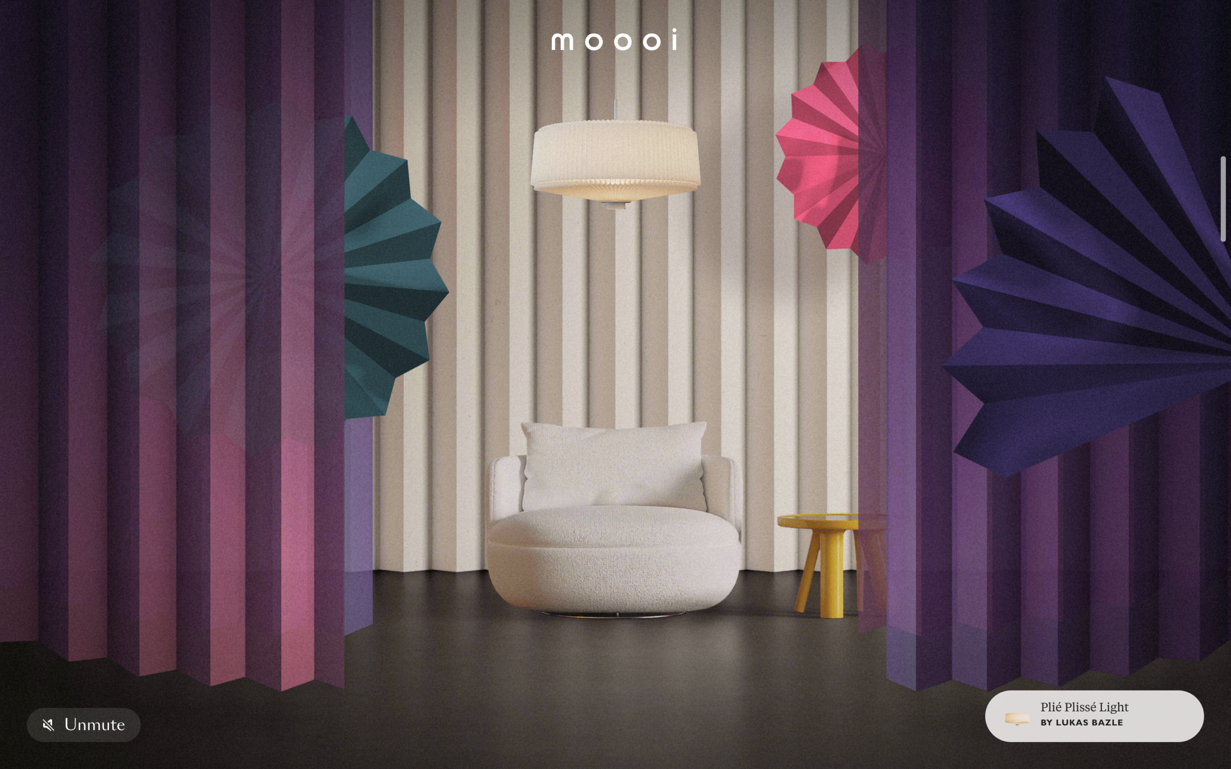
Moooi Paper Play
Step into an Extraordinary Life
Moooi Paper Play
Step into an Extraordinary Life
Best Visual Design - Aesthetic /
Winner
Bridging the gap between the shoppable realm & the extraordinary world of MoooiRémy Barthez, Lead Developer and Margot Gabel, Lead Designer

Q: Once you settled on your idea, what influenced your decision on the chosen technical approach? How did it differ or go beyond approaches you’ve taken in the past?
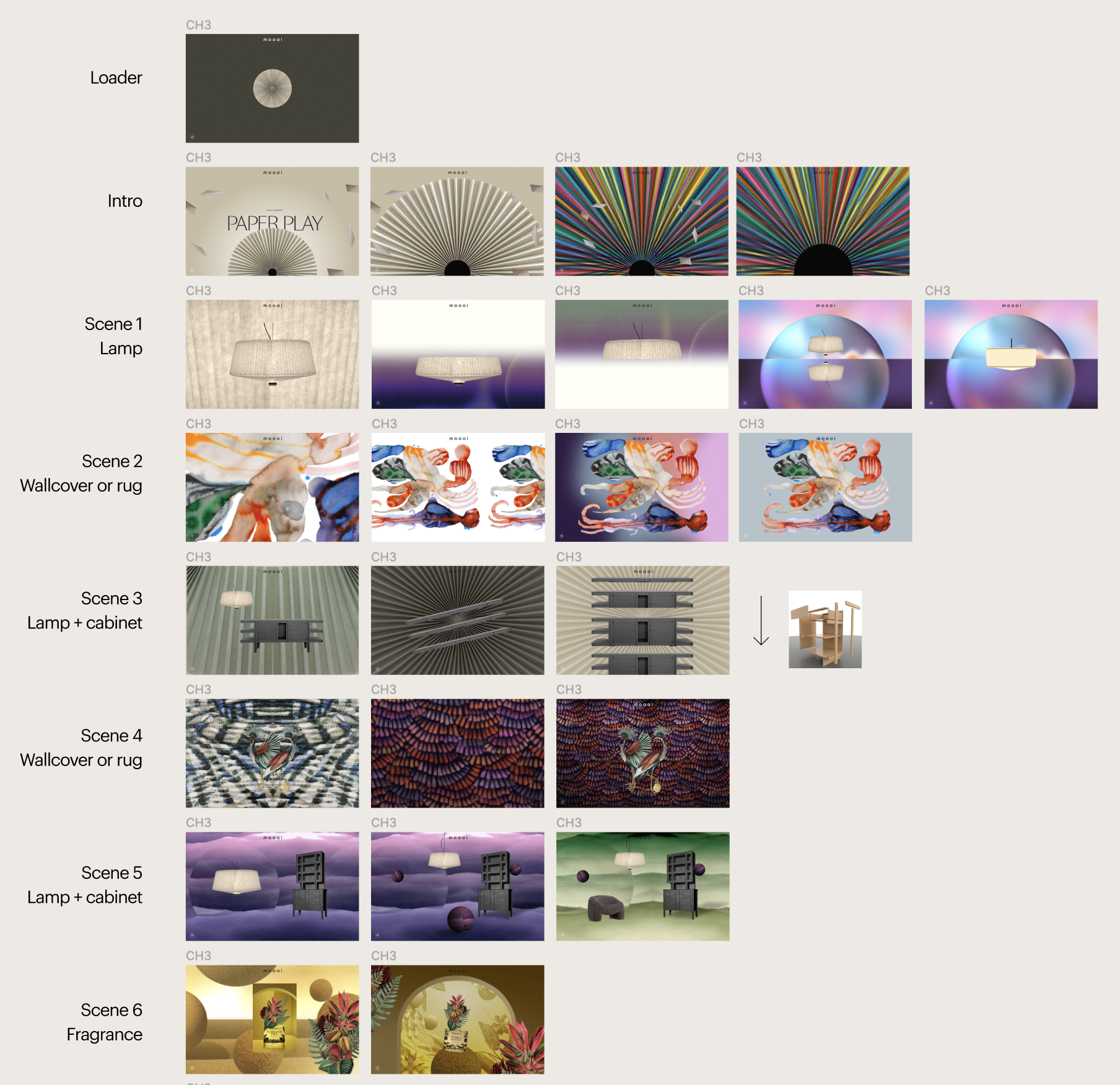
A: For Paper Play, we revived our beloved tech stack from A Life Extraordinary: PixiJS and GSAP. To achieve a cinematic vibe, we crafted scene-by-scene animations and audio transitions using GSAP timelines and PixiJS features.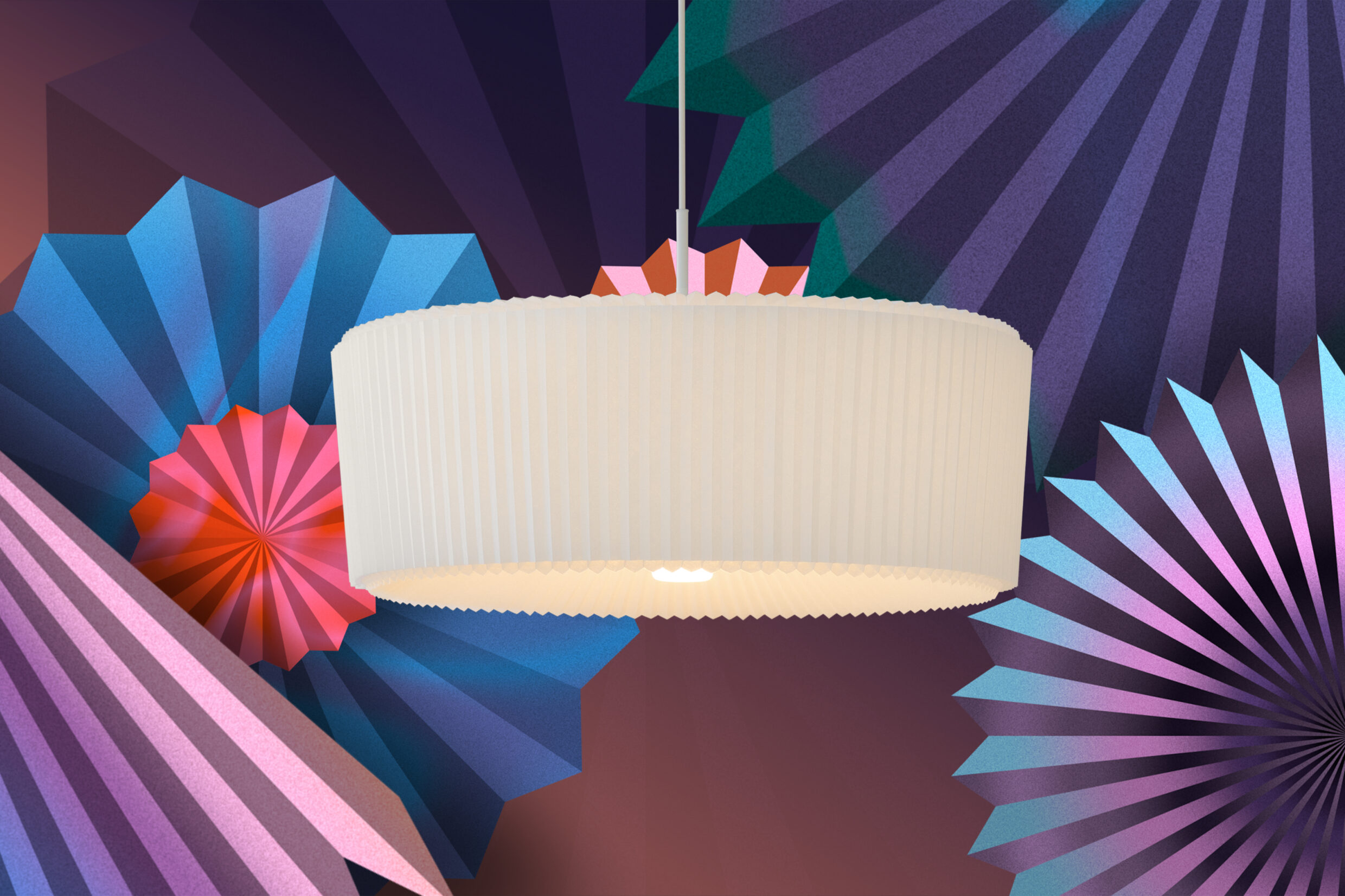
Q: What were some of your biggest learning and takeaways from this project?
A: The unique collaborative process with multi-disciplinary artists. After working with Andres Reisinger for Beauty Blooms & Benoit Challand for Defy Gravity, we teamed up with visual artist Merijn Hos, motion designer Jurrian Hos, and Dutch audio design studio KLOAQ to seamlessly weave all elements into an immersive online experience.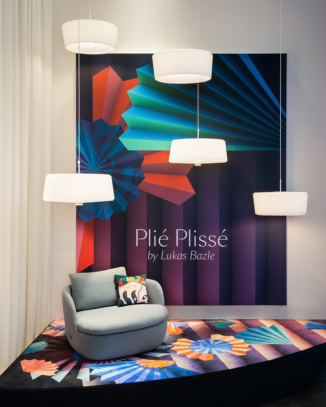
Q: What web technologies, approaches, tools, or resources did you use to develop this experience (WordPress, headless, AI, Sublime Text, HTML5, Adobe XD, etc)?
A: The experience is built using the WebGL framework PixiJS, with GLSL filters. We wrote all animations and audio transitions in GSAP timelines. To generate sprite sheets, we created CLI scripts that use TexturePacker to output three formats (PNG, WebP, and Basis) at two ratios and resolutions (desktop and mobile). Finally, the app is integrated into the React-based Moooi.com e-commerce platform, which uses headless WordPress and WooCommerce.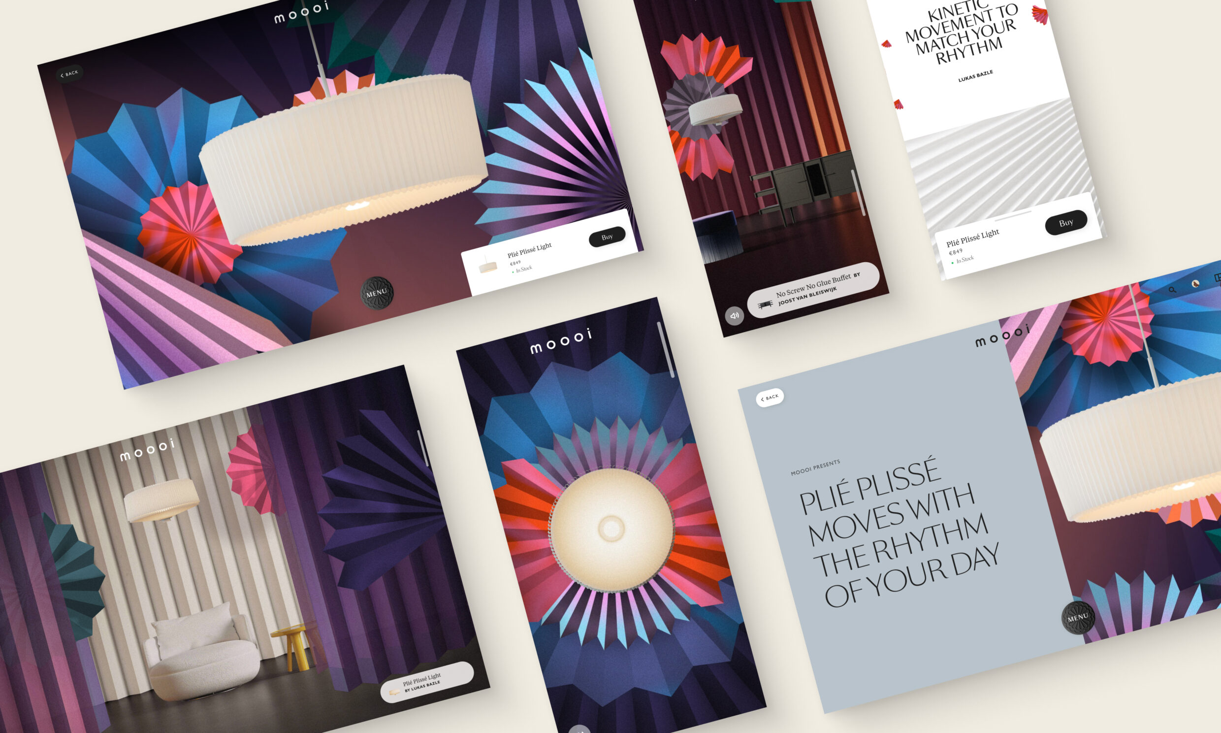
Q: How did the final product meet or exceed your expectations? What results did you see?
A: The pandemic-prompted digital experience brought Moooi's products to life, reaching a wider audience and inspiring a fresh approach to storytelling. The 3-chapter concept extended to Salone del Mobile '23, featuring a 4th chapter, Divine Dreams, and bridged further the online and offline webAR experiences with a multi-sensorial appearance in Milan.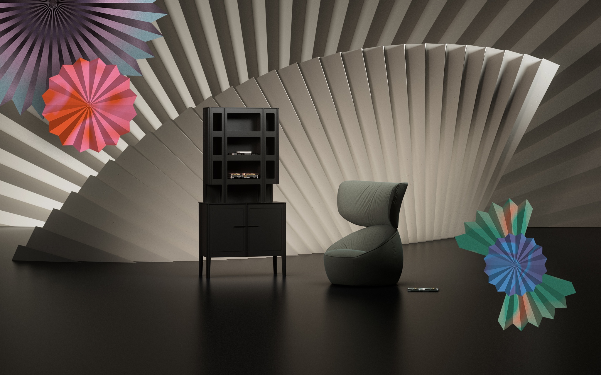
Q: Why is this an exciting time to create new digital experiences? How does your team fit into this?
A: At BIA, we like to fight e-commerce sameness and monotony by crafting digital flagship stores that push boundaries and enrich our clients' brand universe. These digital experiences elevate e-commerce and conversion rates by seamlessly bridging the online and offline worlds.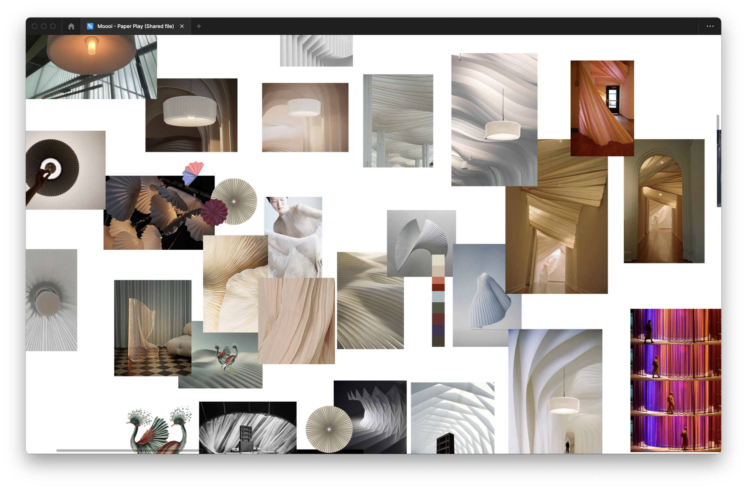
Q: How did you reach a good balance of your own creative ideas and technical capabilities with a fair representation of the client’s brand?
A: Our fruitful long-standing partnership with Moooi has fostered a deep understanding of their creative approach and expectations. Constantly challenging each other, our close collaboration with Moooi and their creative partners strikes the perfect balance.