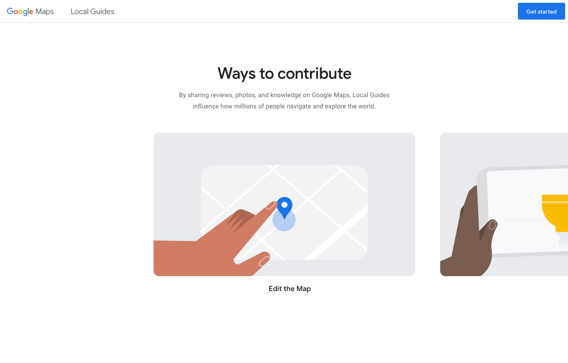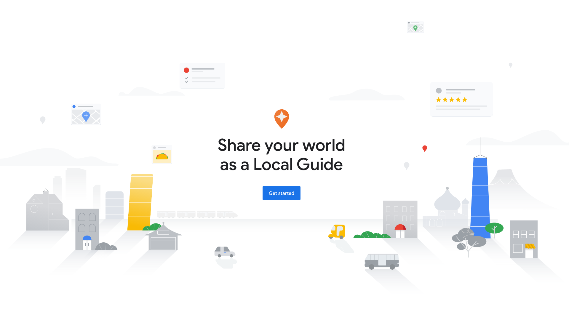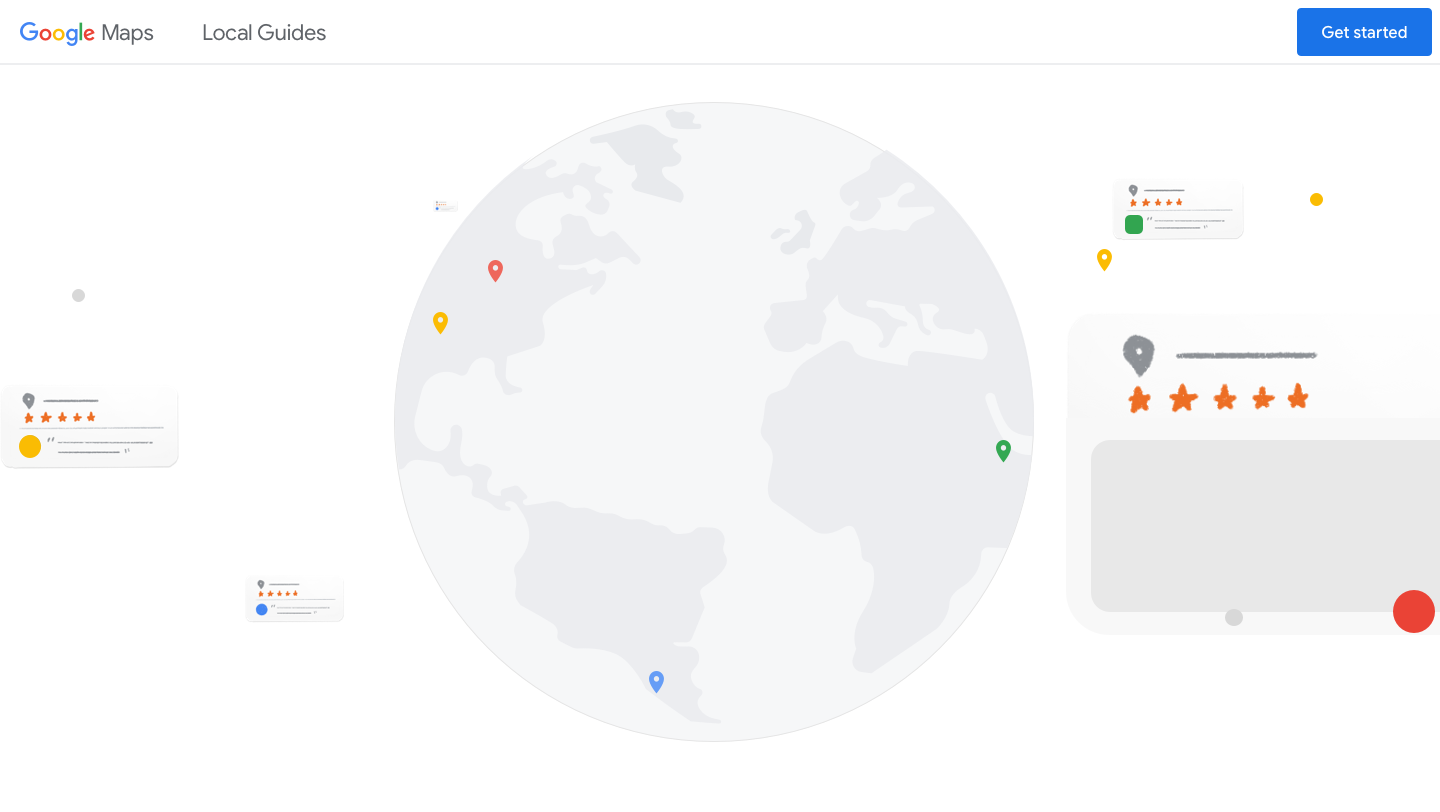
Local Guides are the global community of contributors who share ratings, reviews, and local knowledge of places on Google Maps, helping others in their community. This site educates people on the benefits of joining the program and becoming a Local Guide.- Hook Team

Q: Tell us about your initial moodboard, wireframe, or prototype. How did things change throughout the process?
A: We used Webflow to create a prototype and give the client a sense of how the site would feel. The prototype had minimal animations in it and we used a separate deck to show motion references which helped visualize how each section would come to life. Between a lot of mood boards and animation references, we gave the clients a clear sense of how the static layouts would come to life.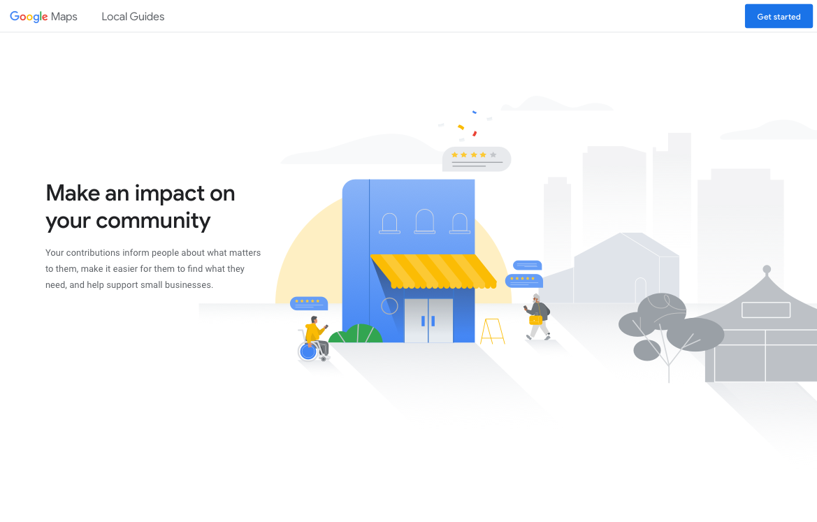
Q: What influenced your chosen technical approach, and how did it go beyond past methods?
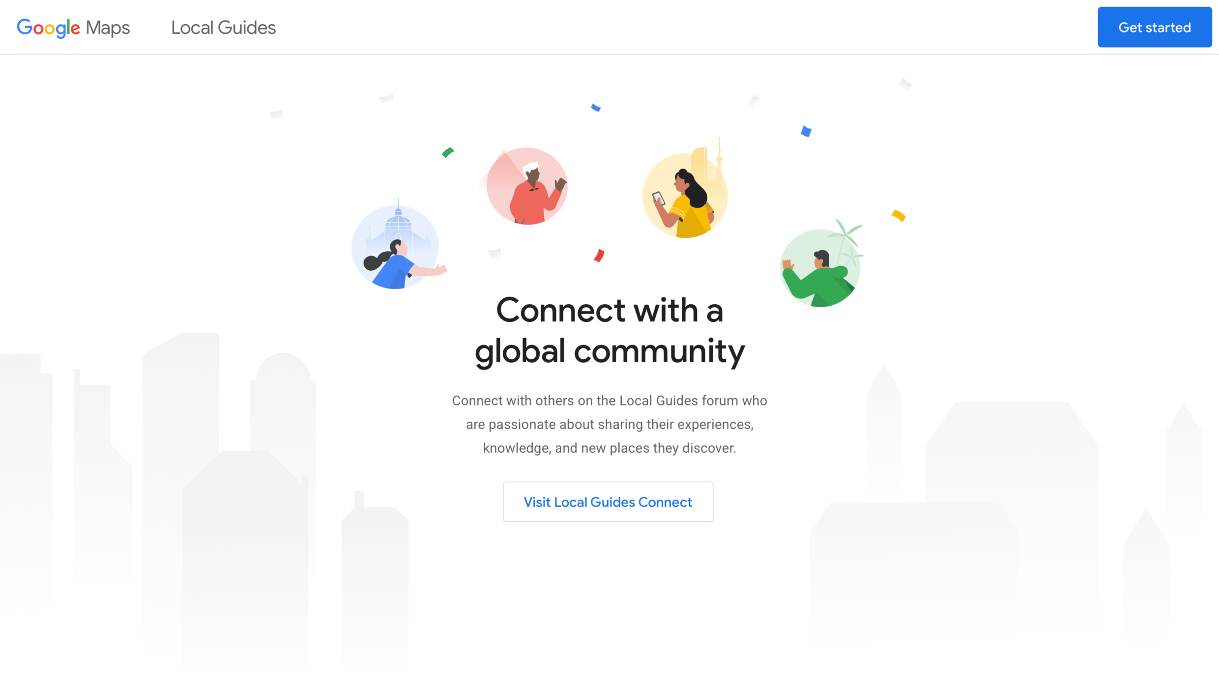
A: Each section in the site was meant to be unique and keep the viewer engaged, so we created animations that would draw the viewer seamlessly from section to section. To do this, we decided on using Lottie animations which give our animators better control over the animations and can be easily exported from After Effects.When did you experience a breakthrough or an "a-ha" moment during this project?
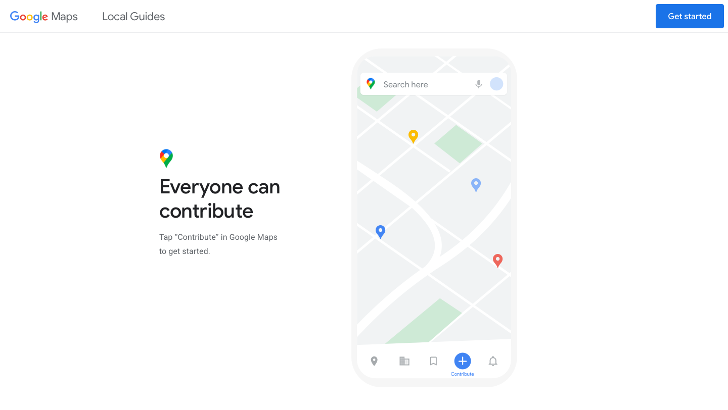
Coming up with a way to demonstrate the impact Local Guides can have was pivotal in concepting this project. To arrive at that "a-ha" moment, we used an untested workflow starting with a white board session where the CD and lead designer sketched out the UX with the goal of creating a compelling reason to join. We knew illustration could best tell our story and went straight into creating animated vignettes that would bring each feature to life.
Q: What web technologies, tools, and resources did you use to develop this?
A: To maintain the fluidity and resolution of the principal animation, Lottie is used to render the After Effects export as SVG. Greensock and custom code link the animation to the scroll position, with a linear interpolation effect for easing. Greensock also generates timelines for hiding/showing text and secondary animations. Internal tools give our team precise control over delay, duration, and ease, before baking the final values into the code.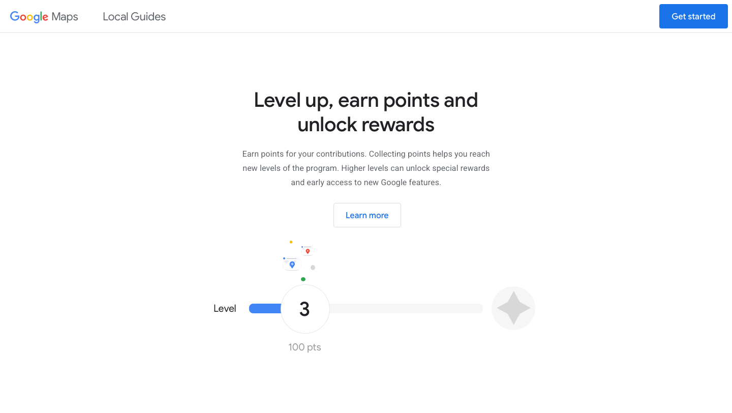
Q: How did the final product meet or exceed your expectations?
A: The site has gone on to win numerous awards across design blogs and the web. The clients were thrilled with the final result, and we’re honored that so much love has been shown towards it!