Tubik Studio/Zealous
Decriminalize
Fairer world is within reach
Decriminalize
Poverty
Fairer world is within reach
Government & Associations /
Webby and People's Voice Winner
The project challenges the narrative around crime & poverty, and offers a path to a safer community.Vladyslav Taran, Art Director


Q: Once you settled on your idea, what influenced your decision on the chosen technical approach? How did it differ or go beyond approaches you’ve taken in the past?
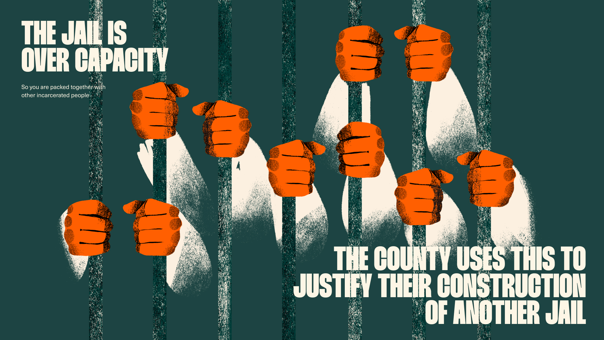
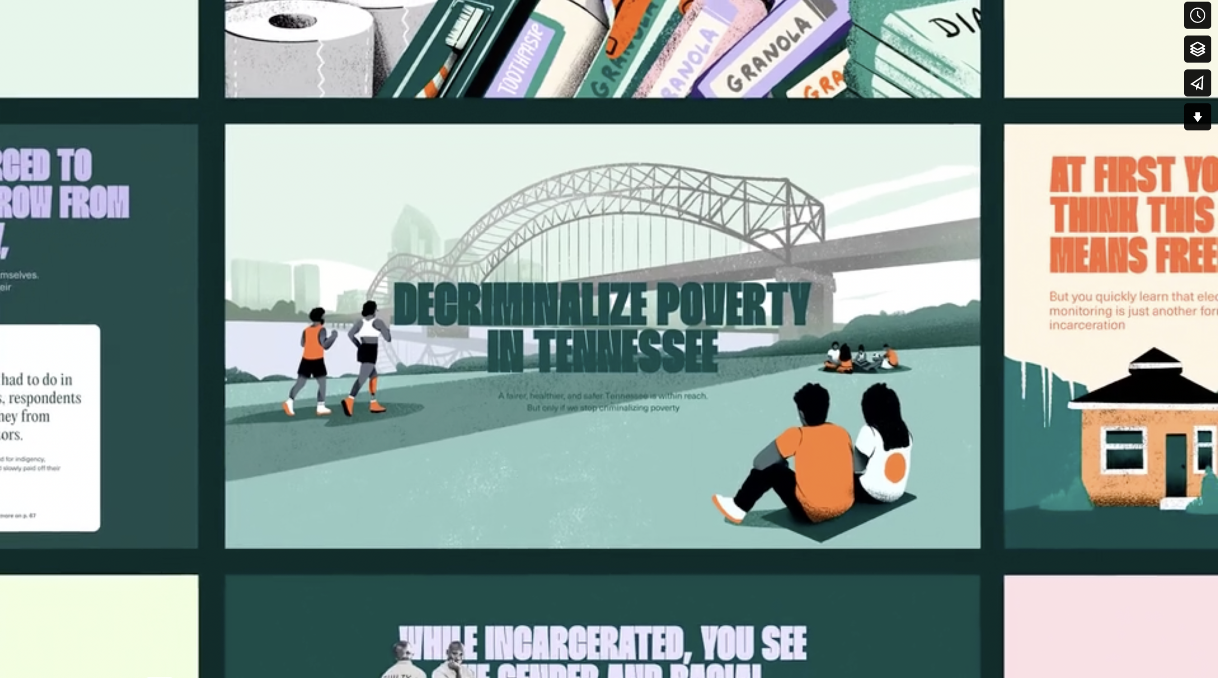
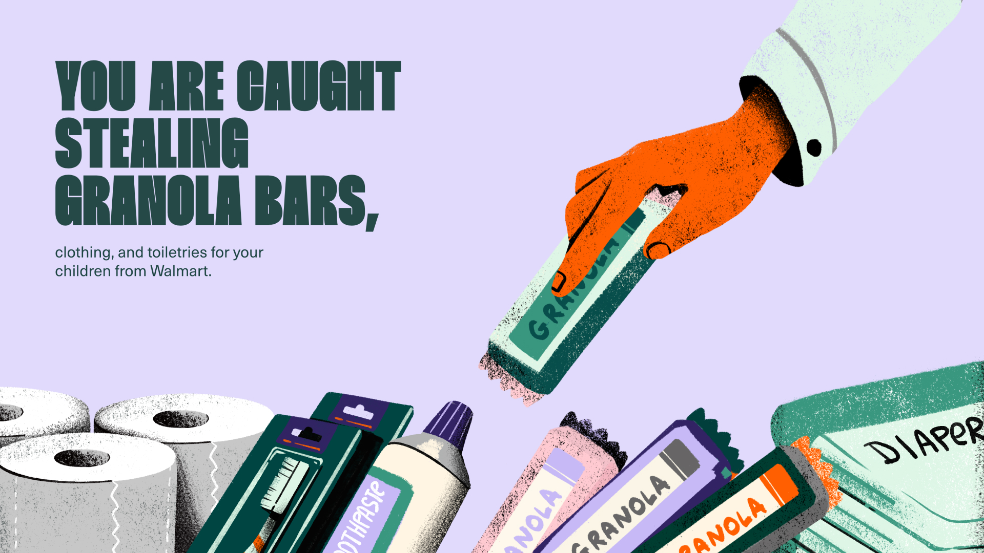
A: Vera and Free Hearts knew their major on-the-ground efforts would shine best as an accessible, wide-reaching digital experience, so they tapped Zealous to translate these complex legal and policy issues into a unique, interactive, story-driven web experience, utilizing a dynamic, “scrollytelling” format that pairs the central narrative with an easily-searchable and filterable database for users to learn from individual stories, themes, or issues.
Q: What were some of your biggest learning and takeaways from this project?
A: Design-forward and story-driven digital experiences are often able to better communicate complex issues than traditional approaches. For many of us, first-person narratives are the main frame through which we see and understand the world, and so we shouldn’t shy away from creative narrative approaches to explain serious topics. They might open up new opportunities for policy discussions and changes that can make a real impact in people’s lives.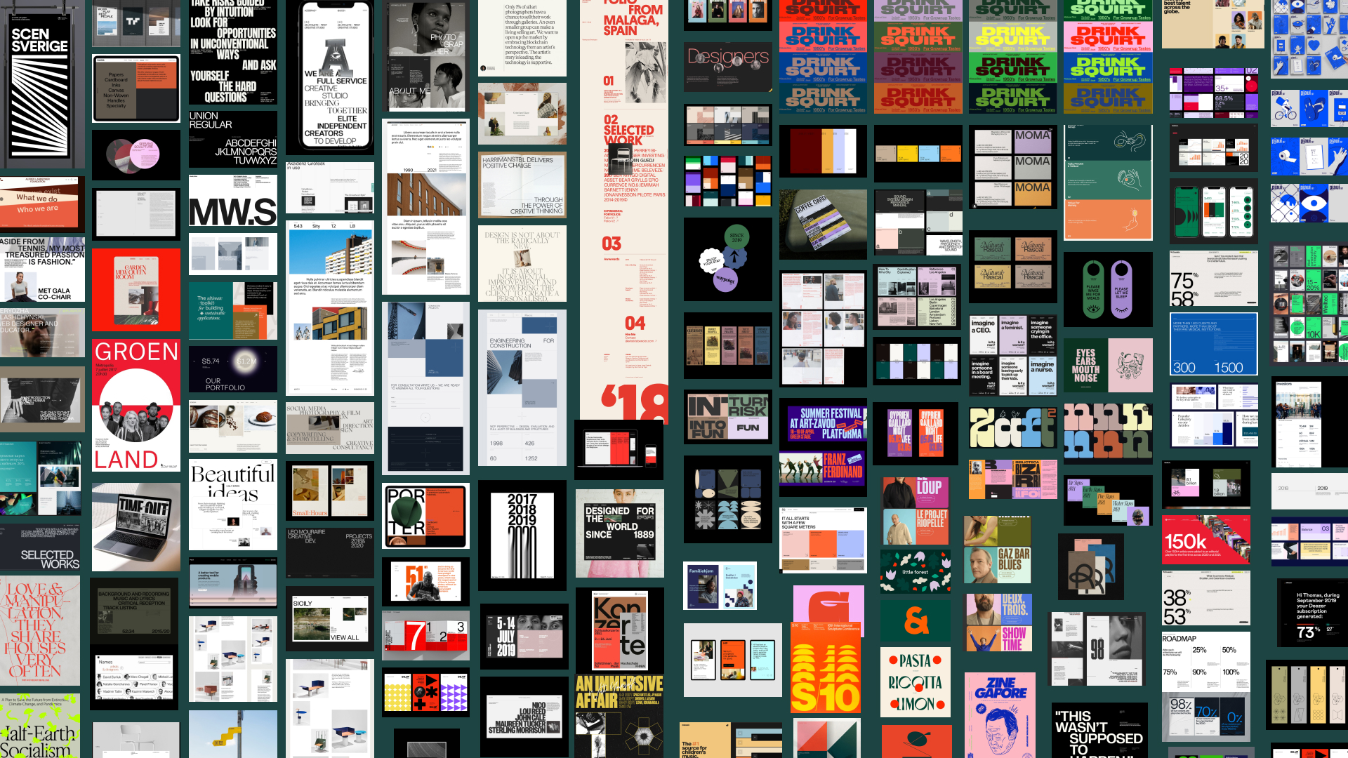
Q: What web technologies, approaches, tools, or resources did you use to develop this experience (WordPress, headless, AI, Sublime Text, HTML5, Adobe XD, etc)?
A: We used Figma, Adobe After Effects and WYSIWYG editor as well as Adobe Photoshop, Procreate for illustrations and collages.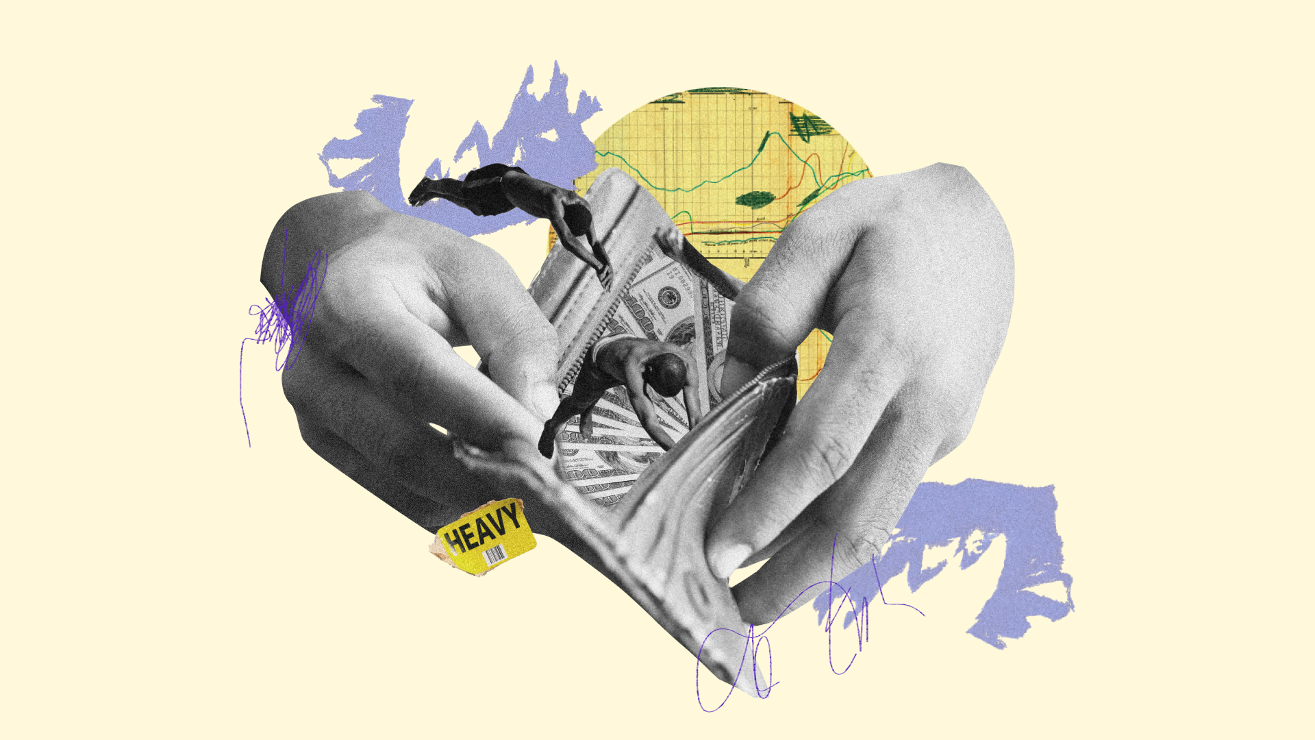
Q: How did the final product meet or exceed your expectations? What results did you see?
A: The final product exceeded our expectations. The vibrant, color-forward, and optimistic treatment of the topic, and the centrality of first-person storytelling paired with reaction animation has opened up new possibilities to breathe life into these issues—and equipped Free Hearts and other grassroots advocates with a powerful new tool to shift the public narrative around punishment, poverty, and safety in Tennessee.