Code and Theory
Bustle -
Bustle -
Modern Storytelling
for Bustle Digital Group
Cultural Blog/Website /
Nominee
"The card is the foundation of every story and is highly flexible for the story it needs to tell. The story determines the presentation — not the other way around."Code and Theory


Q: What influenced your chosen technical approach, and how did it go beyond past methods?
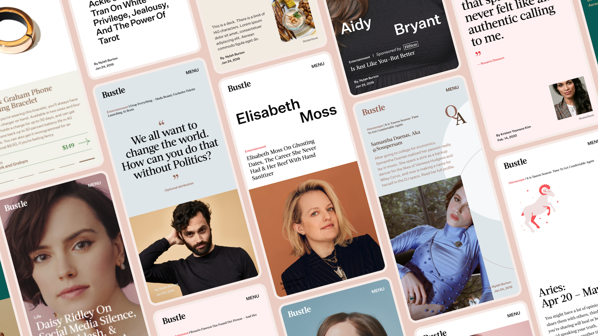
A: The Bustle redesign leverages the card system foundation we’d developed for BDG over the years but with a unique design approach. Digital Issue Hubs and long-form article pages support Bustle’s content calendars: monthly issues, cover shoots and sit-down interviews.
Q: What web technologies, tools, and resources did you use to develop this?
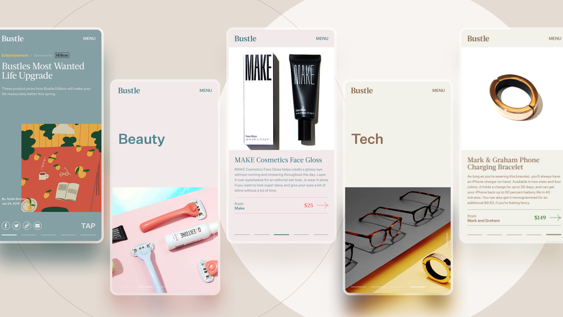
A: We used BDG’s custom card system CMS that allows for endless visual card customizations. The card is the foundation of every story and is highly flexible for the story it needs to tell. The story determines the presentation — not the other way around.When did you experience a breakthrough or an "a-ha" moment during this project?
In designing this site, we realized that the incorporation of content and commerce is critical, so it was essential to design flexible experiences that could support consumption and conversion.
